
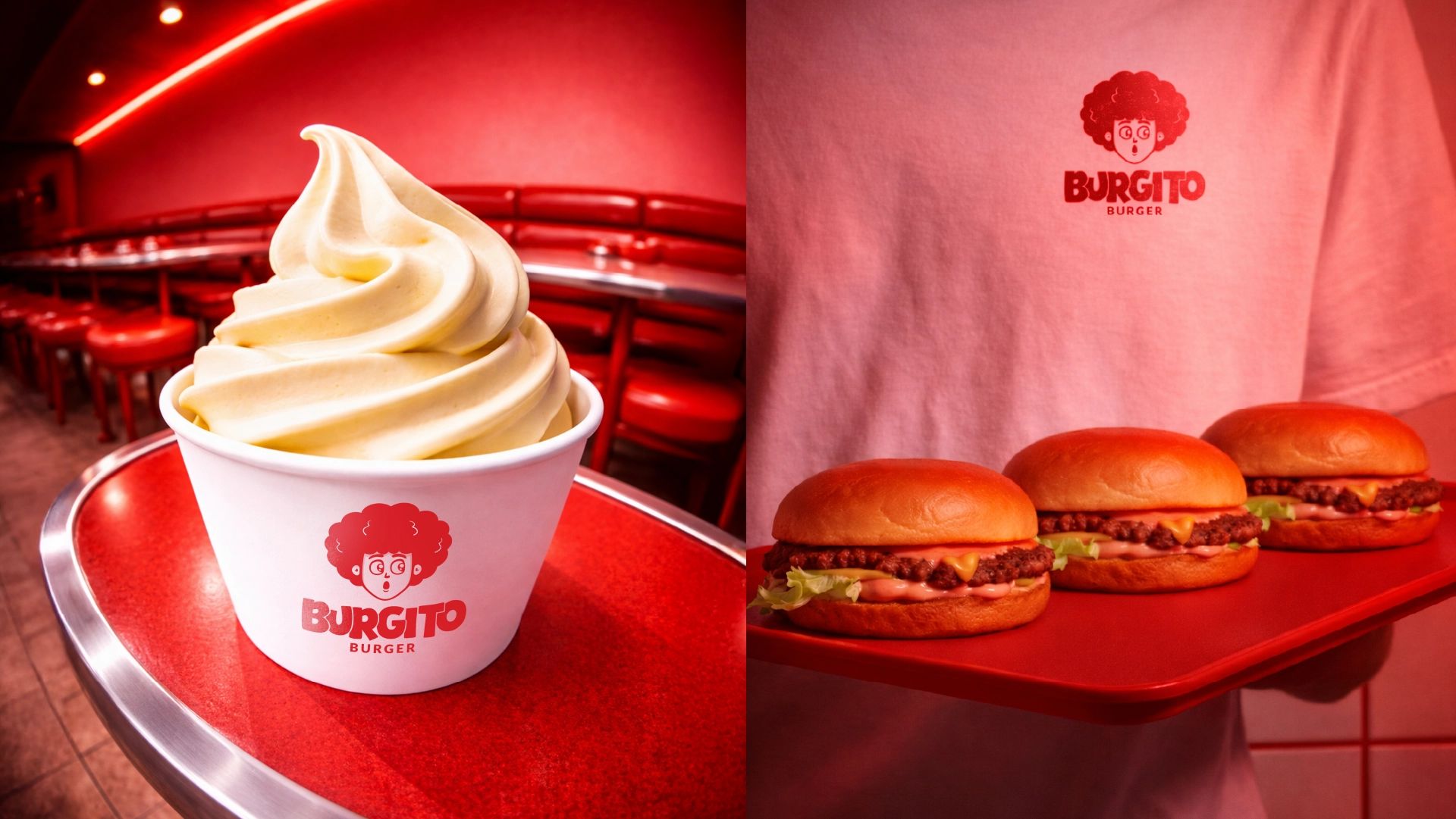
BURGITO

Burgito
A playful burger brand built from appetite, slang, and a wink of retro diner energy.
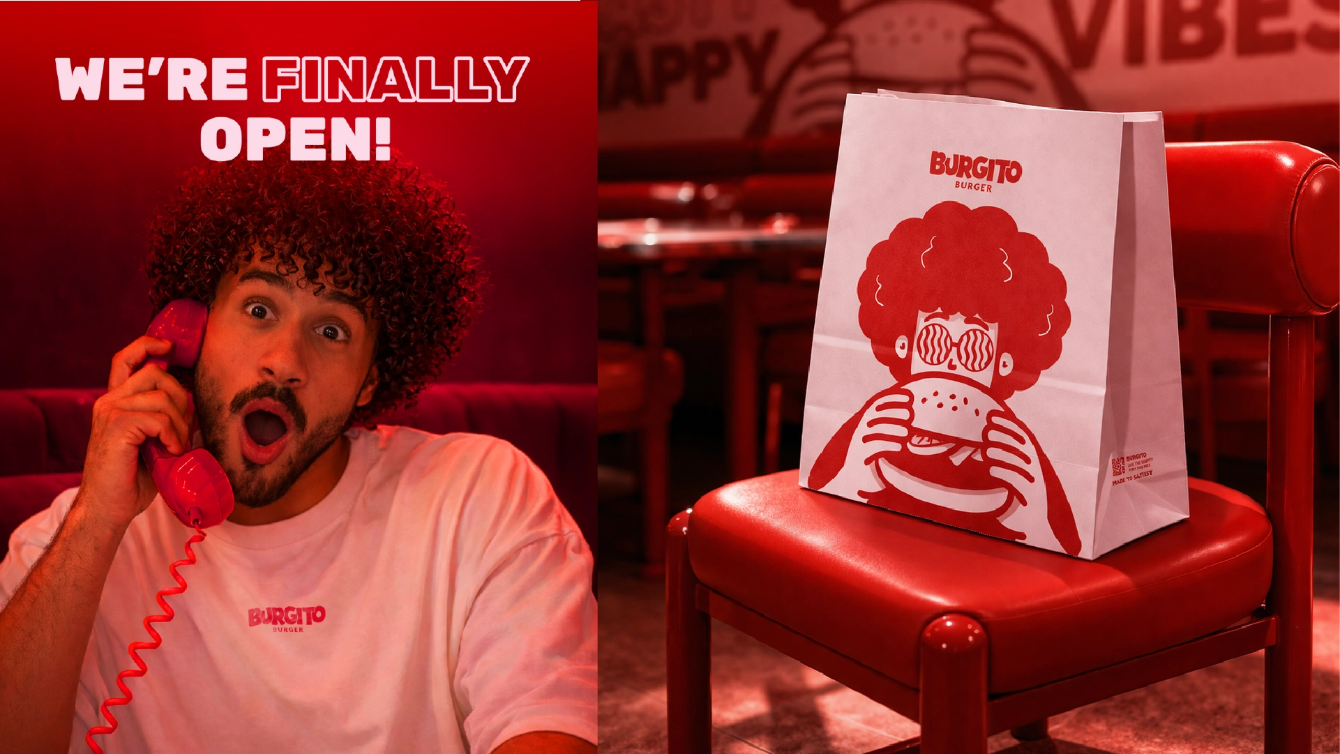
Burgito is a compact brand identity study that turns a fast-food premise into a bold character system, packaging language, and campaign-ready visual toolkit.
Discovery
Understanding the core narrative, gathering requirements, and defining technical constraints.
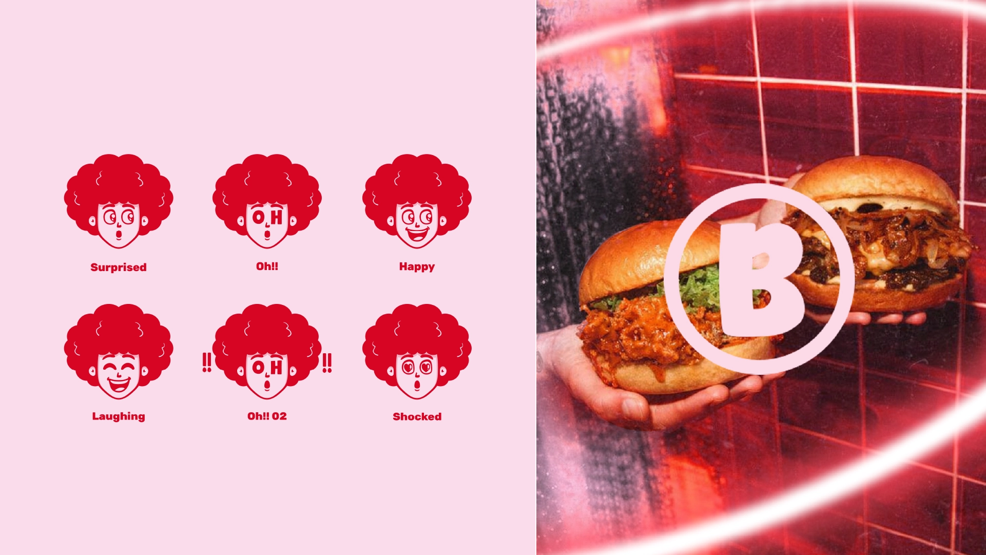
Design
Crafting the visual language, typography scales, interactions, and motion curves.
Build
Developing the architecture and engineering the responsive frontend experience.
Launch
Performance optimization, accessibility audits, scaling, and final deployment.
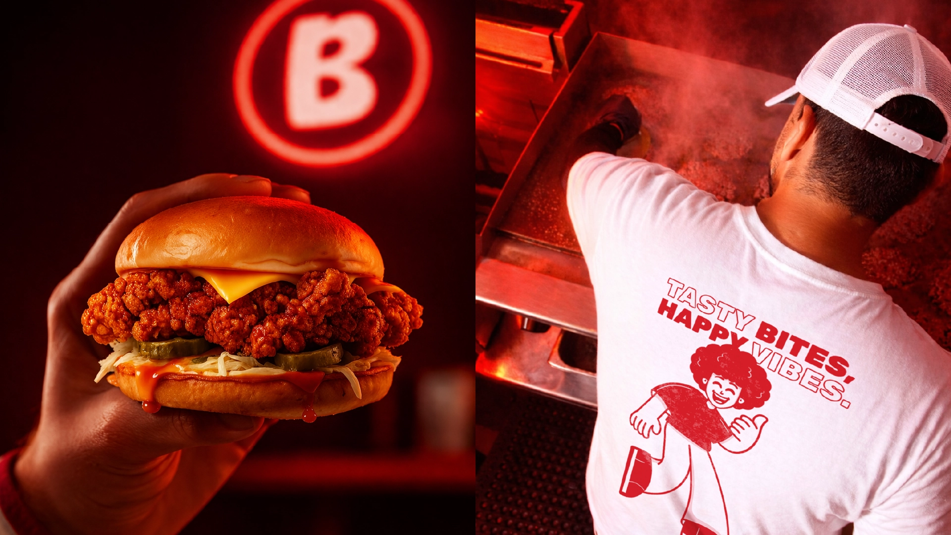
Concept
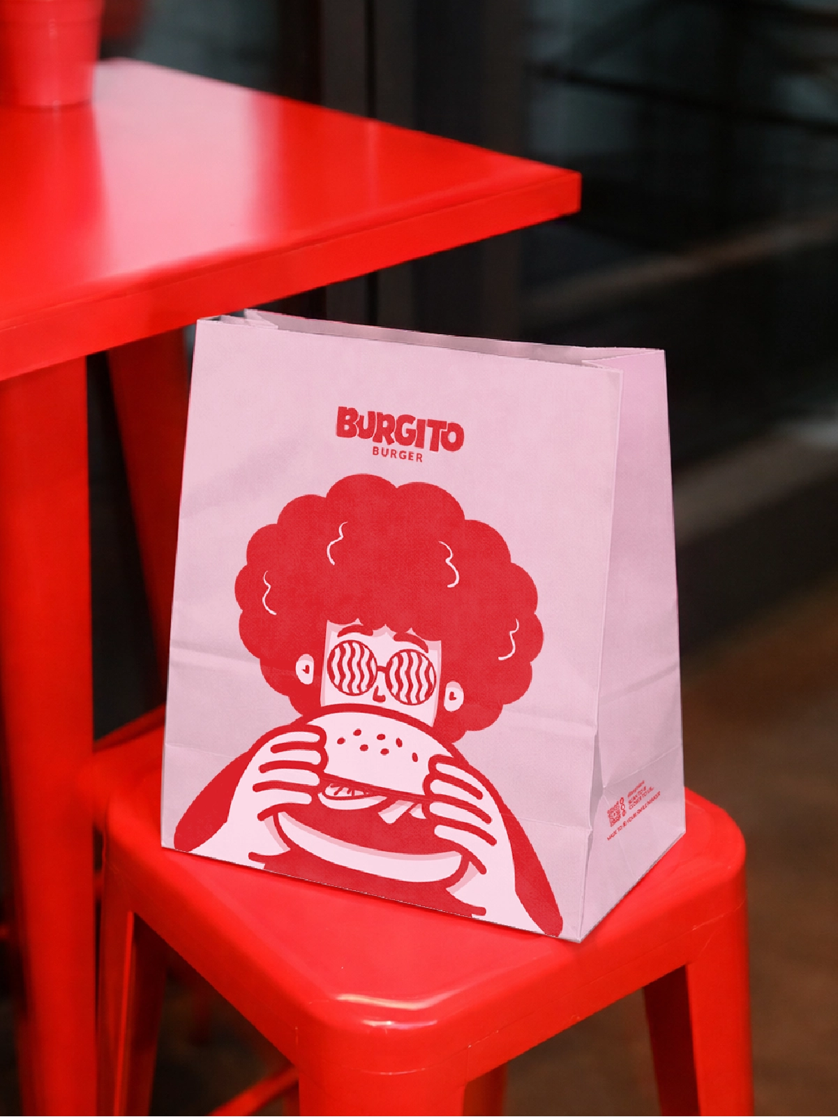
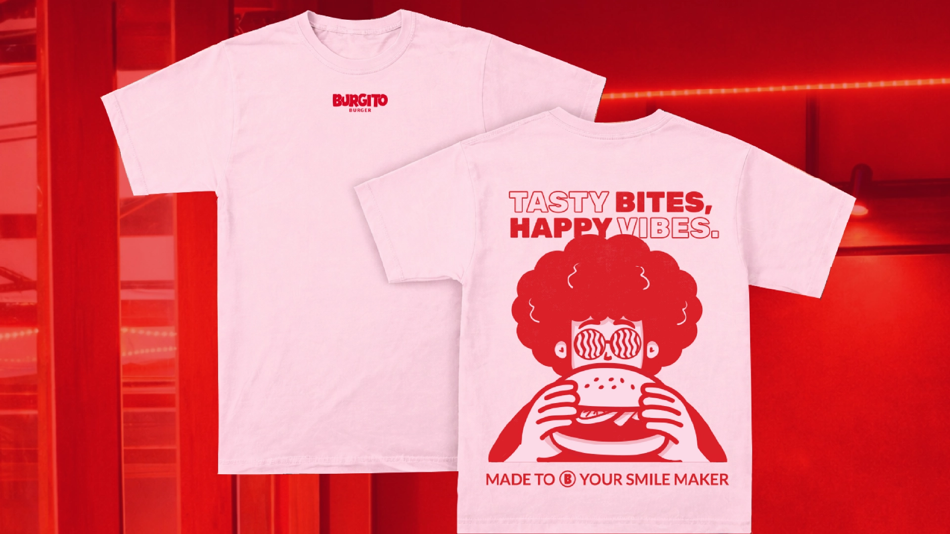
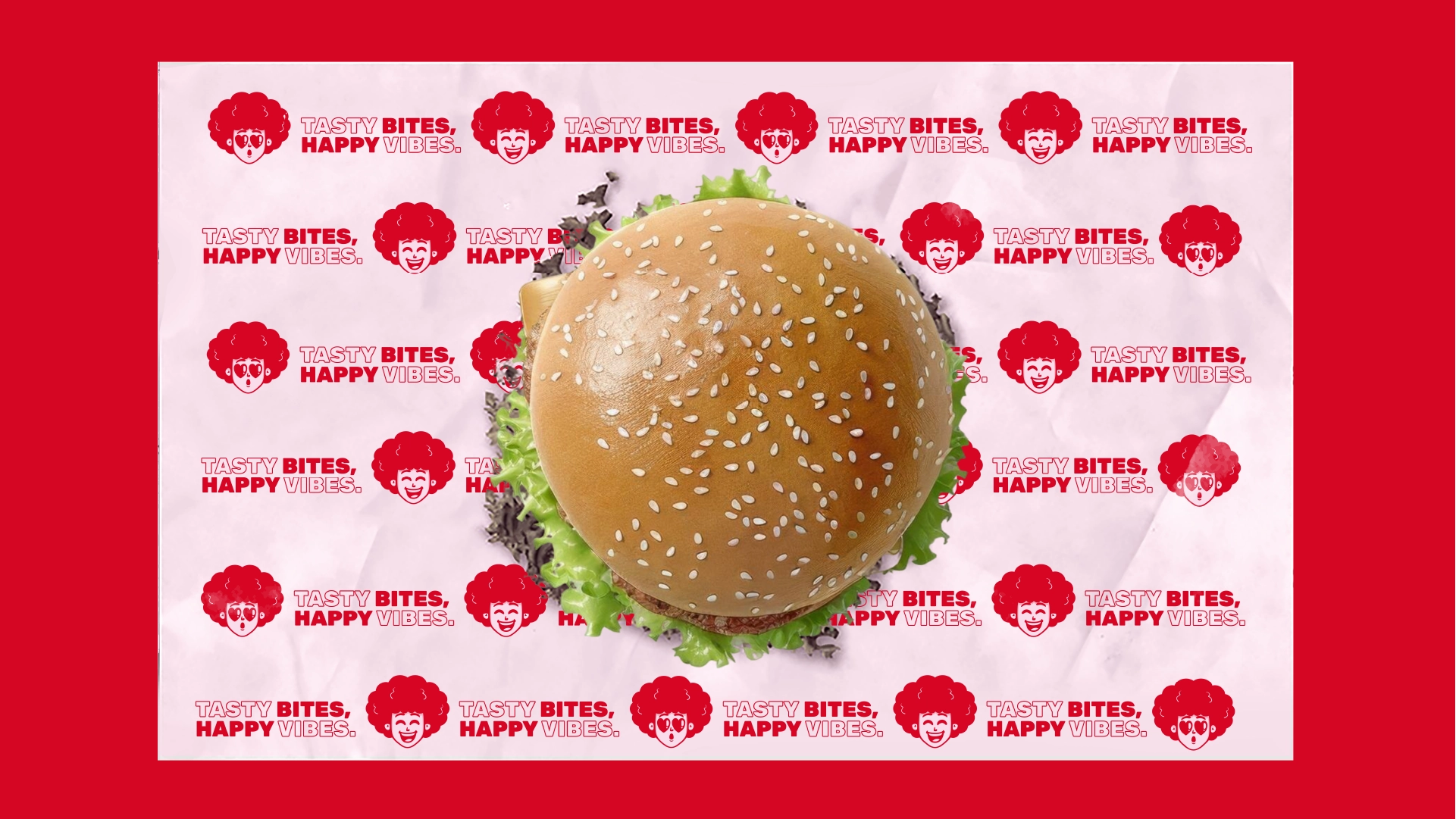
Burgito isn’t just about burgers. It’s about tasty bites and happy vibes.
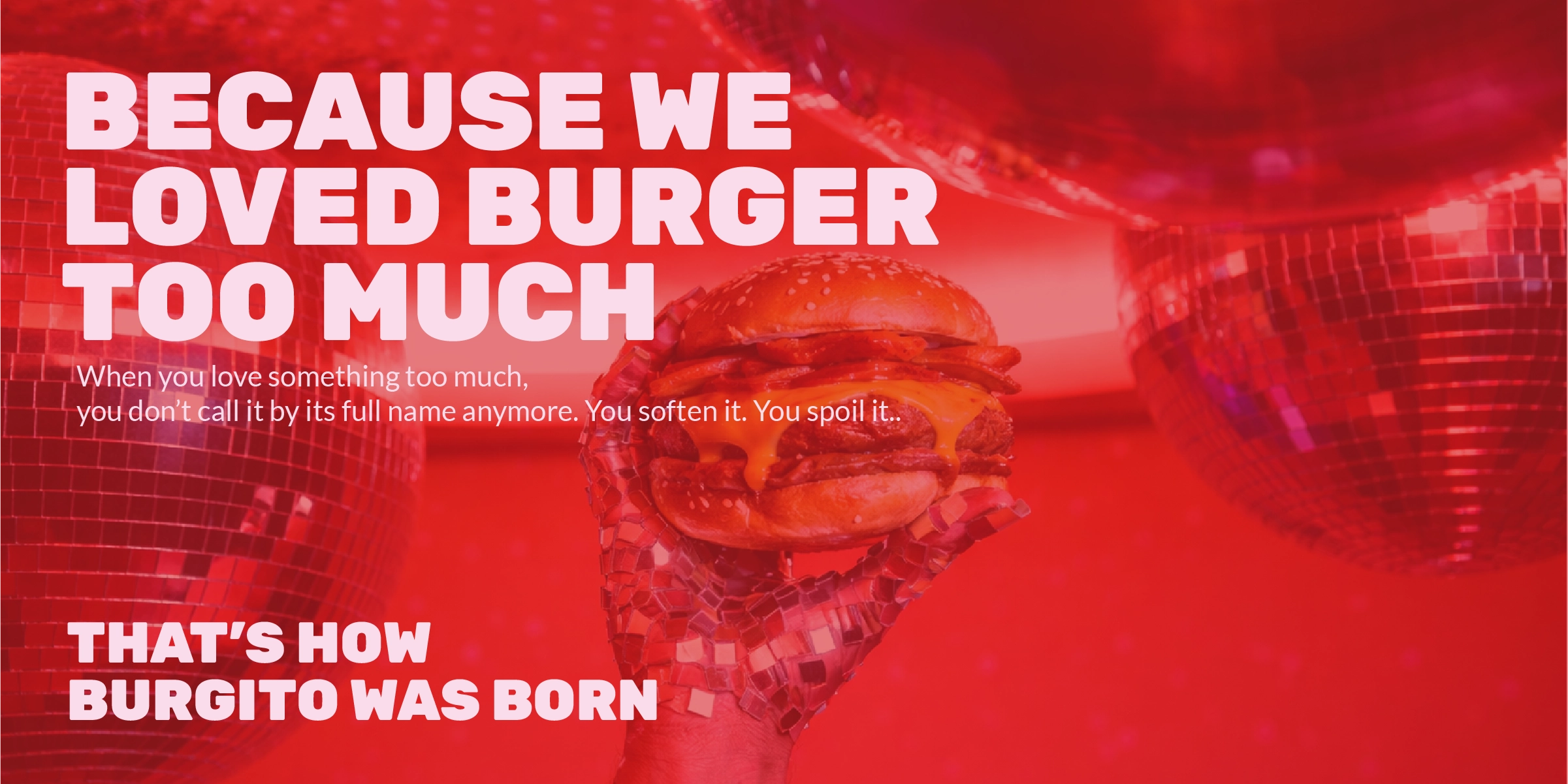
Burgito was never meant to feel like a typical burger brand. It was built from a feeling — the same way nicknames are created. When people love something deeply, they stop calling it by its full name.
Concept
Burgito isn’t just about burgers. It’s about tasty bites and happy vibes.
Burgito was never meant to feel like a typical burger brand. It was built from a feeling — the same way nicknames are created. When people love something deeply, they stop calling it by its full name.
“Every pixel serves a purpose. Every interaction tells a story.”
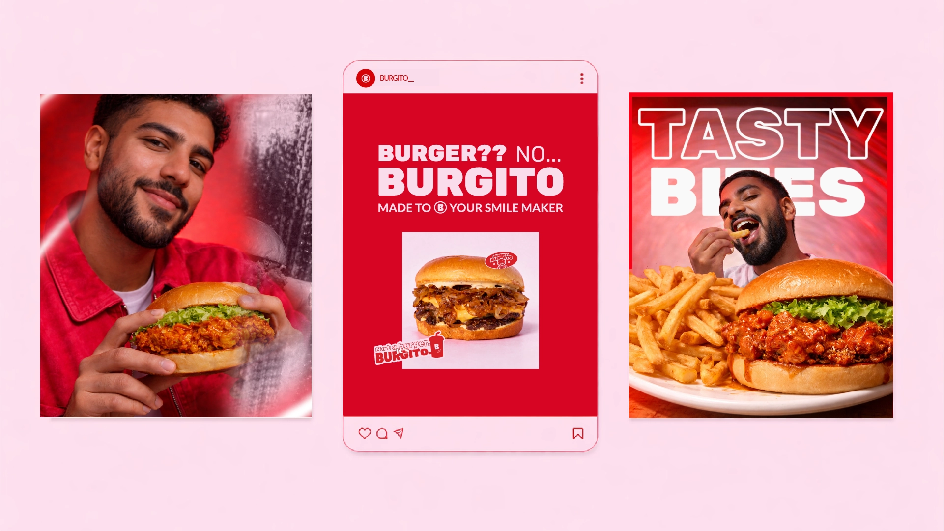
Color System
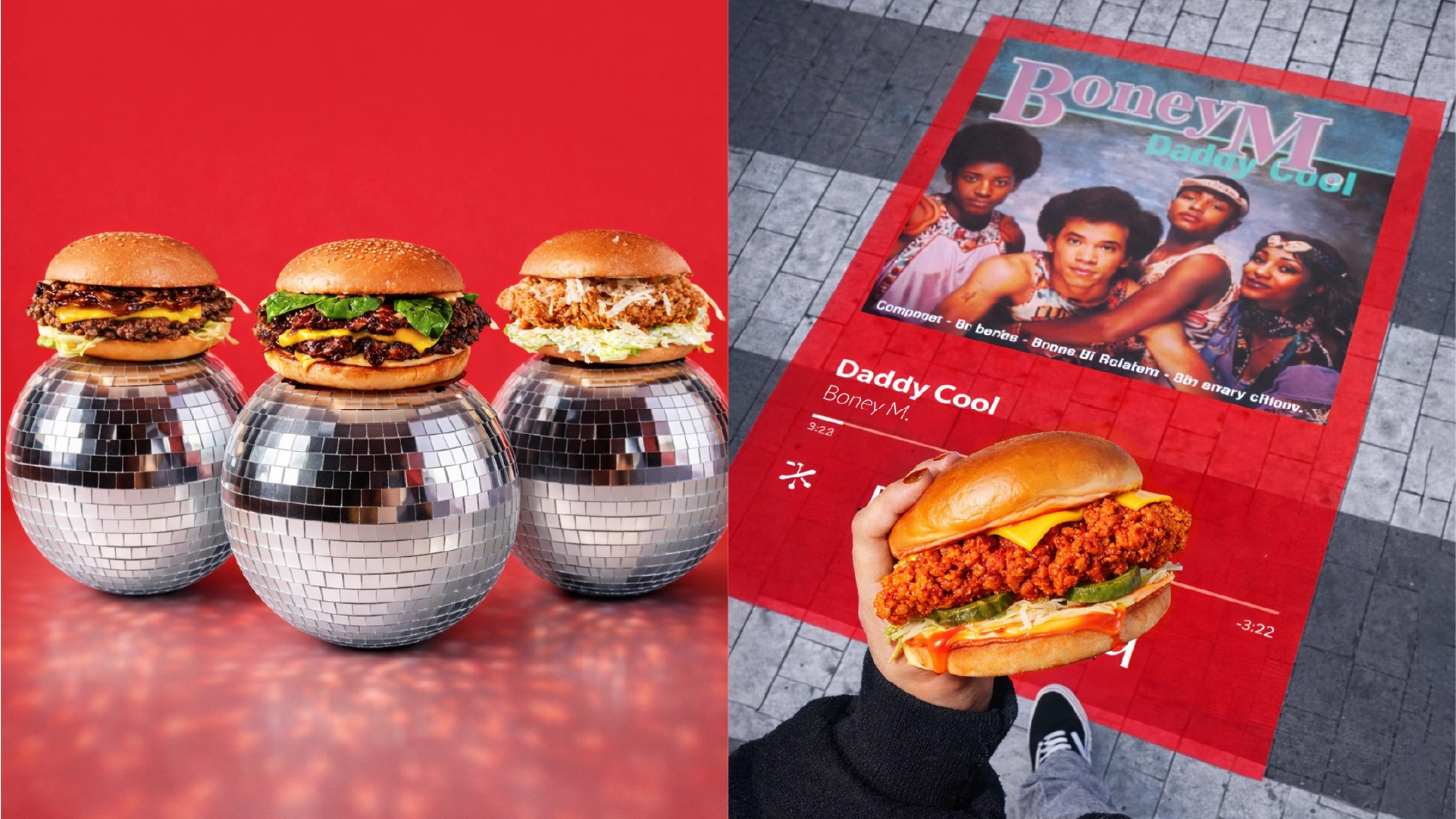
The Burgito color palette was designed to feel loud, youthful, and emotionally warm. Burgito Red acts as the main energy source of the identity — inspired by appetite, nightlife, pop culture, neon lights. Blush Pink softens the experience and adds a playful lifestyle feeling that balances the intensity of the red. Together, the two colors create the signature Burgito mood: energetic, fun, nostalgic, and social. Black and white were introduced as grounding tones to keep the system clean, flexible, and highly adaptable across packaging, social media, uniforms, and interiors.
Color System
The Burgito color palette was designed to feel loud, youthful, and emotionally warm. Burgito Red acts as the main energy source of the identity — inspired by appetite, nightlife, pop culture, neon lights. Blush Pink softens the experience and adds a playful lifestyle feeling that balances the intensity of the red. Together, the two colors create the signature Burgito mood: energetic, fun, nostalgic, and social. Black and white were introduced as grounding tones to keep the system clean, flexible, and highly adaptable across packaging, social media, uniforms, and interiors.
The carefully curated palette that brings the digital experience to life.
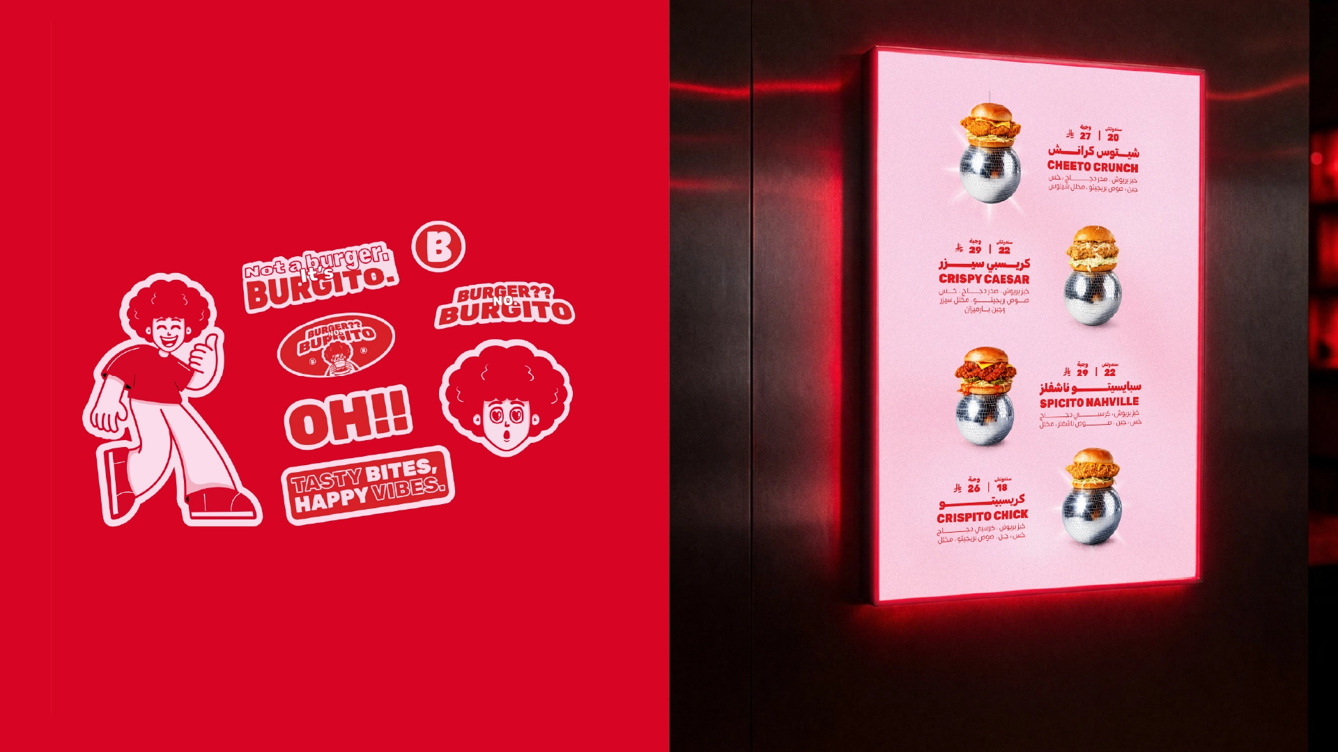
Results & Impact
Project Impact
Key outcomes that define the project's success and lasting value.
1 of 3
Clarity
A readable identity that stays loud across sizes and formats.
2 of 3
Flexibility
A component system that supports endless brand applications.
3 of 3
Expression
Packaging and campaign visuals that feel cohesive, not templated.
Related projects
Services: Branding, Packaging, Campaign Visuals
Deliverables: Identity toolkit, mascot system, social templates
Studio: Creative Core