
LIMA

lima
A refined abaya brand designed to feel modern, composed, and premium across retail and digital touchpoints.
lima builds a fashion identity around restraint and polish—rich burgundy tone, soft blush contrast, and an editorial system that carries from packaging to garment presentation and social rollouts.
Discovery
Understanding the core narrative, gathering requirements, and defining technical constraints.
Design
Crafting the visual language, typography scales, interactions, and motion curves.
Build
Developing the architecture and engineering the responsive frontend experience.
Launch
Performance optimization, accessibility audits, scaling, and final deployment.
Concept
Fashion-first restraint
The concept phase framed lima through composition and tone: controlled layouts, shadow-led imagery, and burgundy as a signature of depth and confidence.
By keeping the typography minimal and the palette disciplined, the brand stays modern and premium across retail and digital contexts.
“Every pixel serves a purpose. Every interaction tells a story.”
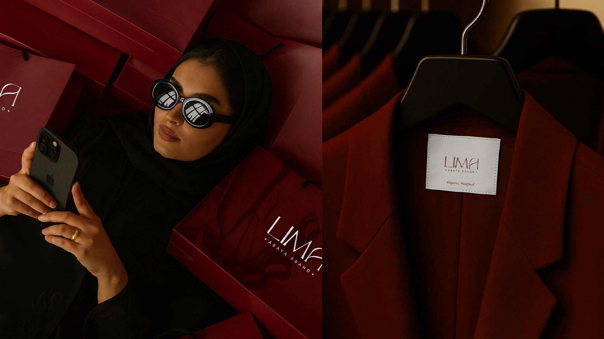
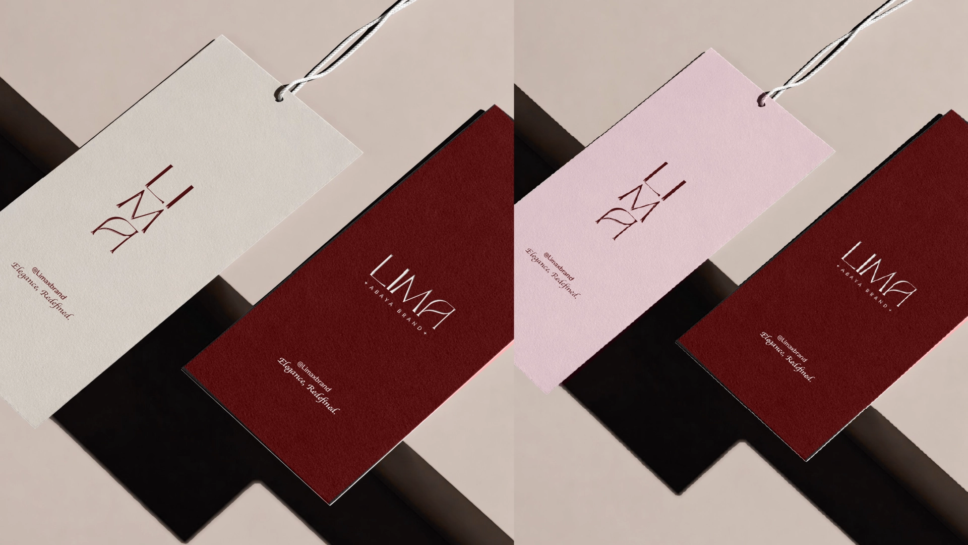
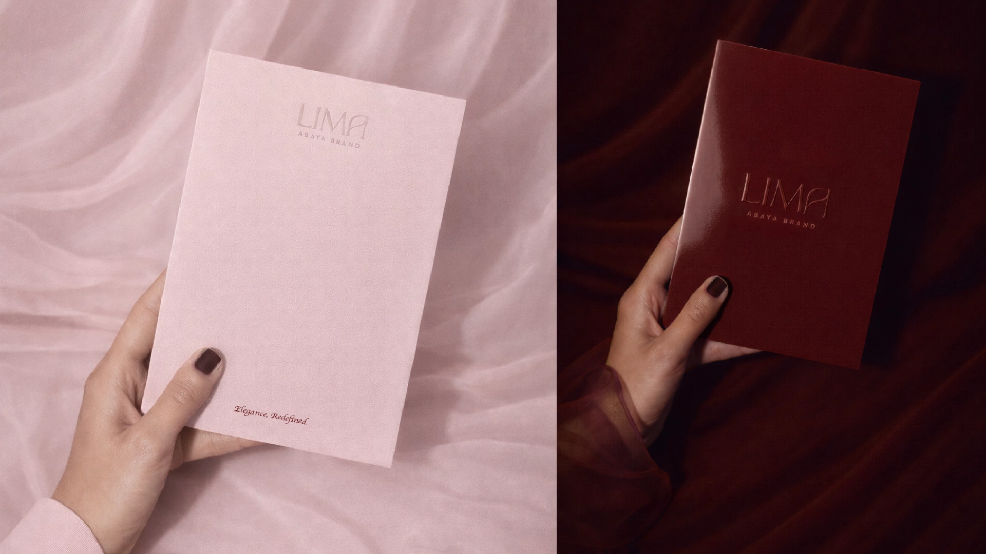
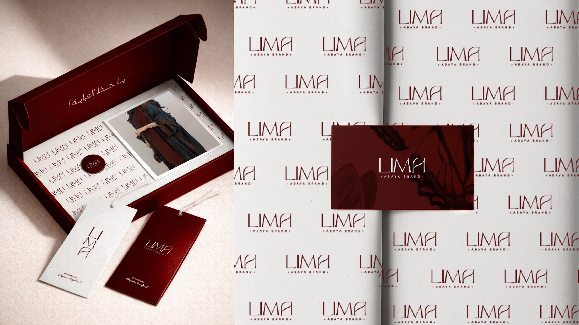
Identity System
Logo application and restrained print language
The identity system focuses on repeatable applications—labels, packaging, and stationery—where restraint reads as quality.
Supporting print elements are quiet by design, letting the garments and editorial styling carry the visual lead.
Identity System
Logo application and restrained print language
The identity system focuses on repeatable applications—labels, packaging, and stationery—where restraint reads as quality.
Supporting print elements are quiet by design, letting the garments and editorial styling carry the visual lead.
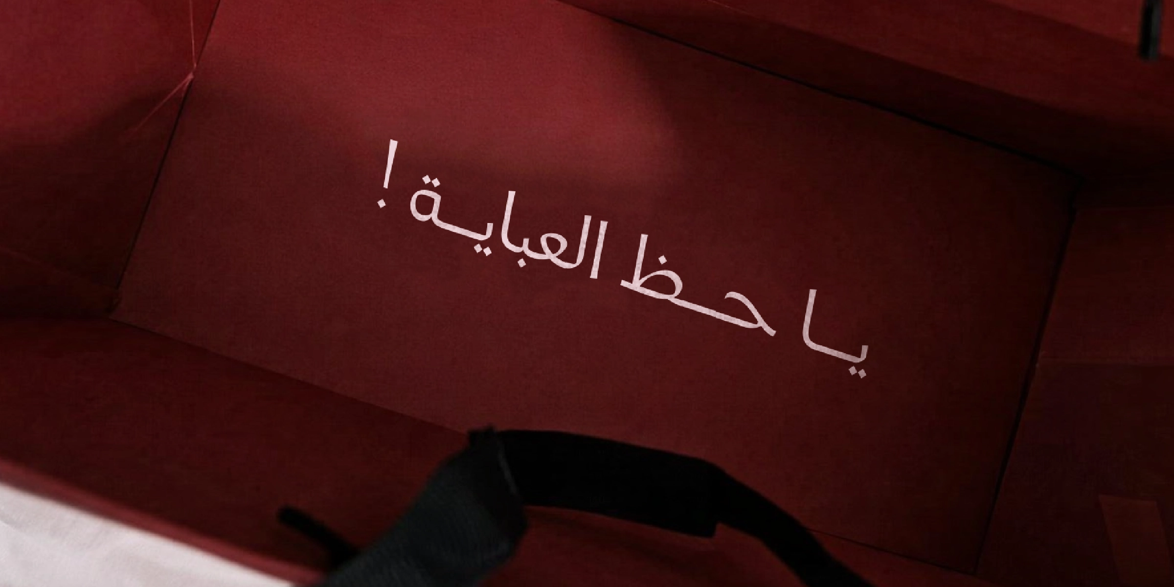
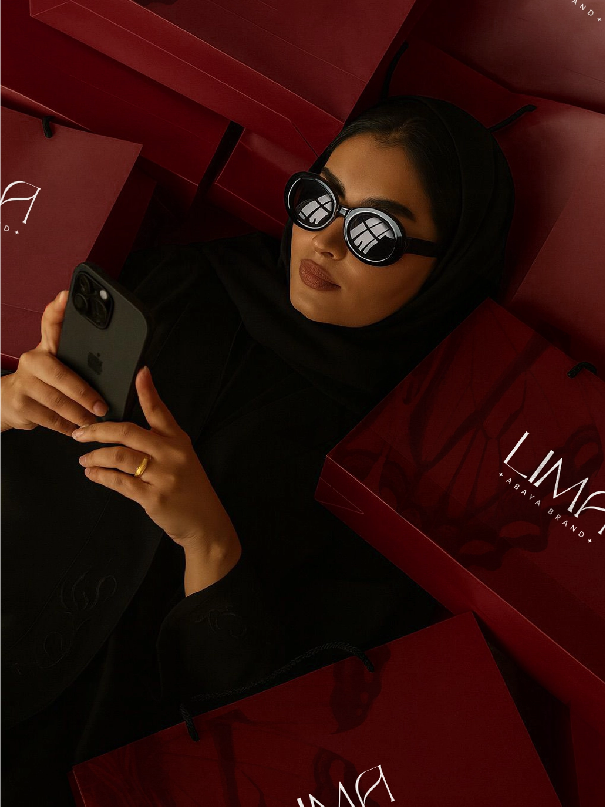
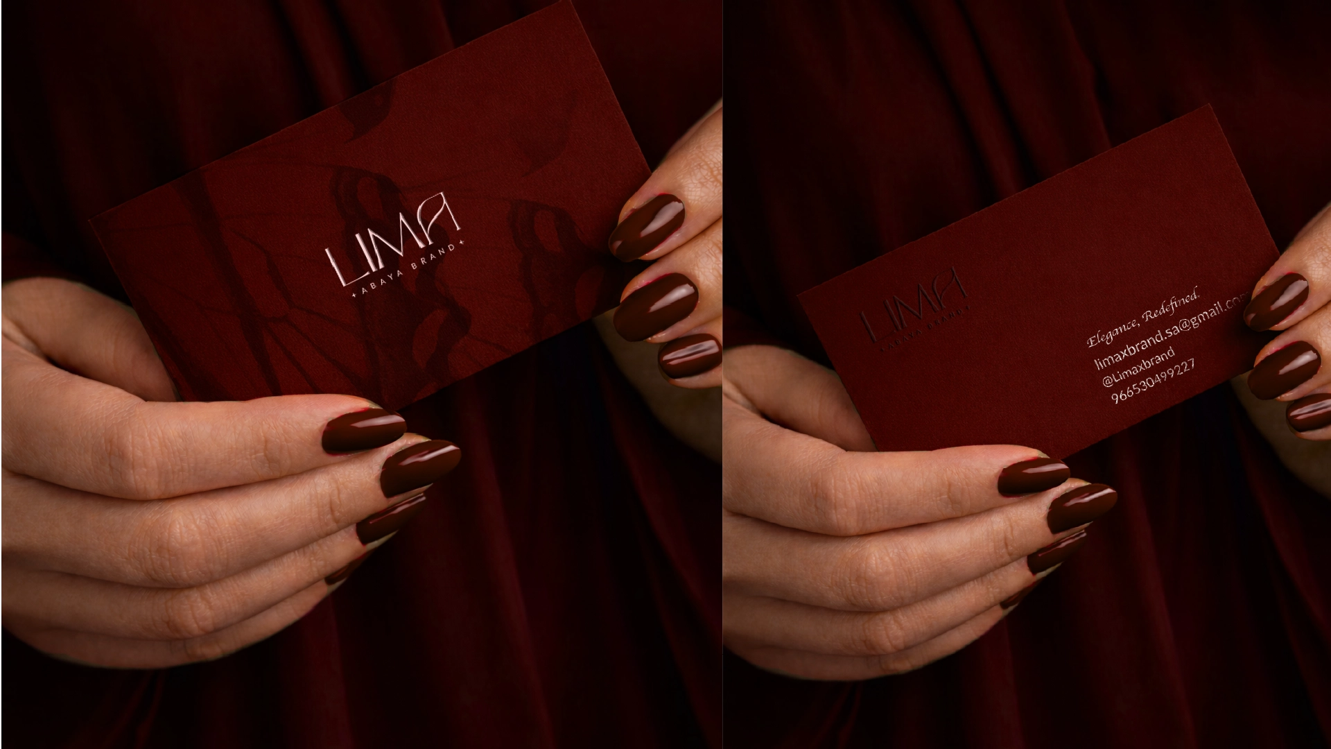
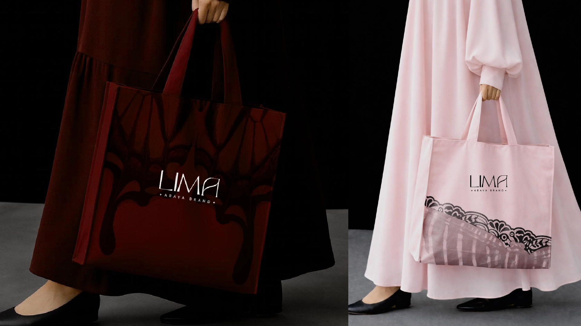
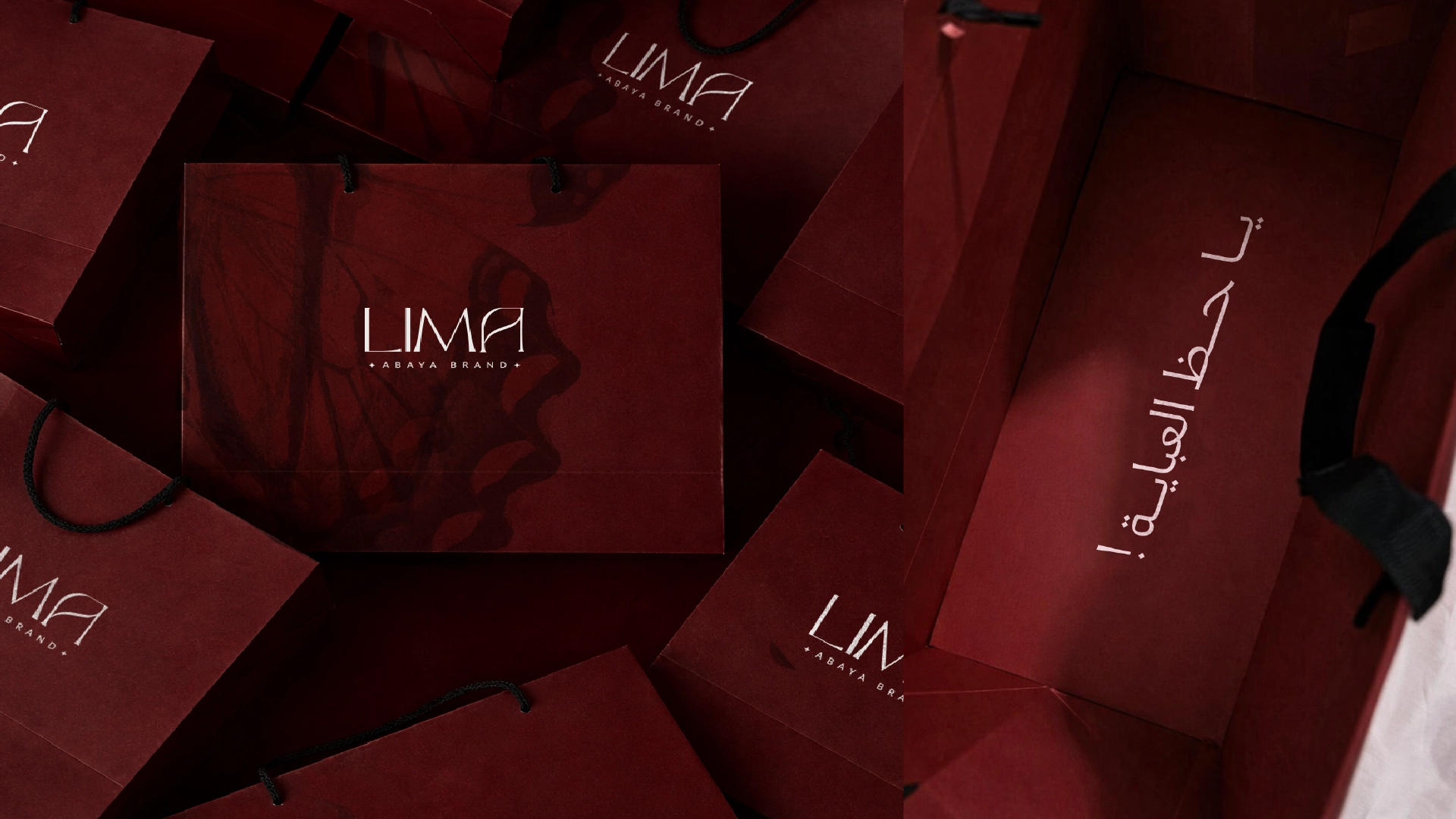
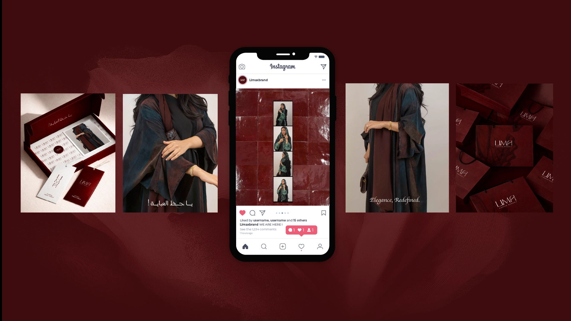
Brand In Use
Packaging, tags, and social rollout
Brand-in-use applications prioritize cohesive presentation: bags, tags, cards, and packaging moments designed to feel composed in-hand and on-camera.
The system translates cleanly to social assets, maintaining the same premium tone through typography, color, and spacing discipline.
The carefully curated palette that brings the digital experience to life.
Results & Impact
Project Impact
Key outcomes that define the project's success and lasting value.
1 of 3
Recognition
Stronger recognition through a disciplined, fashion-led identity system.
2 of 3
Consistency
Consistent expression across packaging, tags, stationery, and social touchpoints.
3 of 3
Premium Feel
A premium brand presence supported by controlled typography and tonal contrast.
Related projects
Services: Branding, Visual Identity, Packaging Direction, Art Direction