
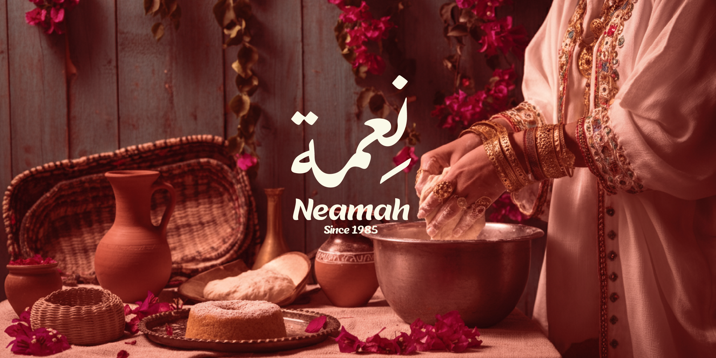
NEAMAH

Neamah
A heritage bakery identity shaped to feel celebratory, culturally rooted, and premium across gifting and retail touchpoints.
Neamah reframes a heritage sweets and bakery brand as a warm, giftable visual world—floral illustration, soft-tone packaging, and gold-led details across categories, seasons, and retail presentation.
Discovery
Understanding the core narrative, gathering requirements, and defining technical constraints.
Design
Crafting the visual language, typography scales, interactions, and motion curves.
Build
Developing the architecture and engineering the responsive frontend experience.
Launch
Performance optimization, accessibility audits, scaling, and final deployment.
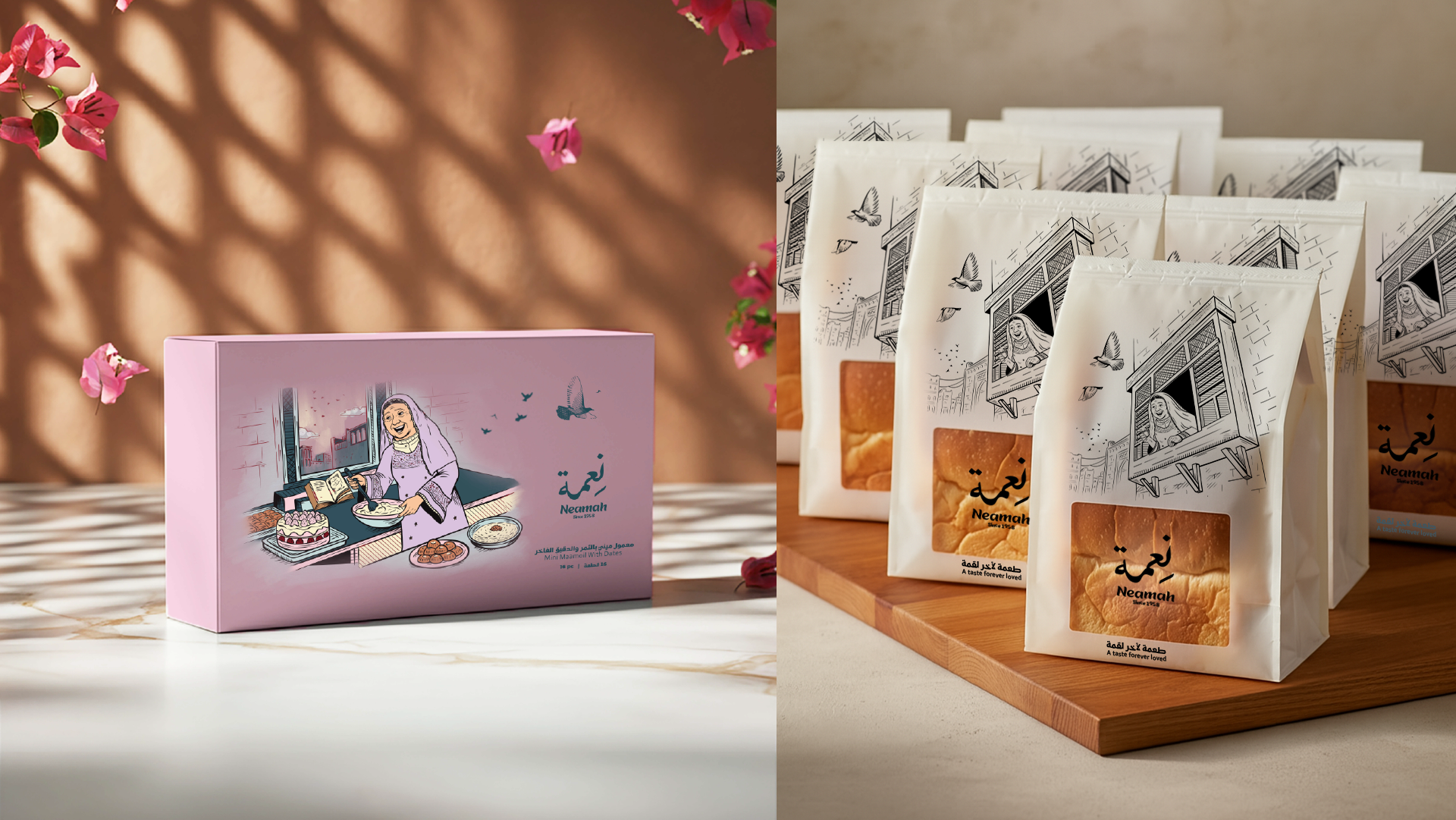
Concept
Memory, generosity, and the value of sweets
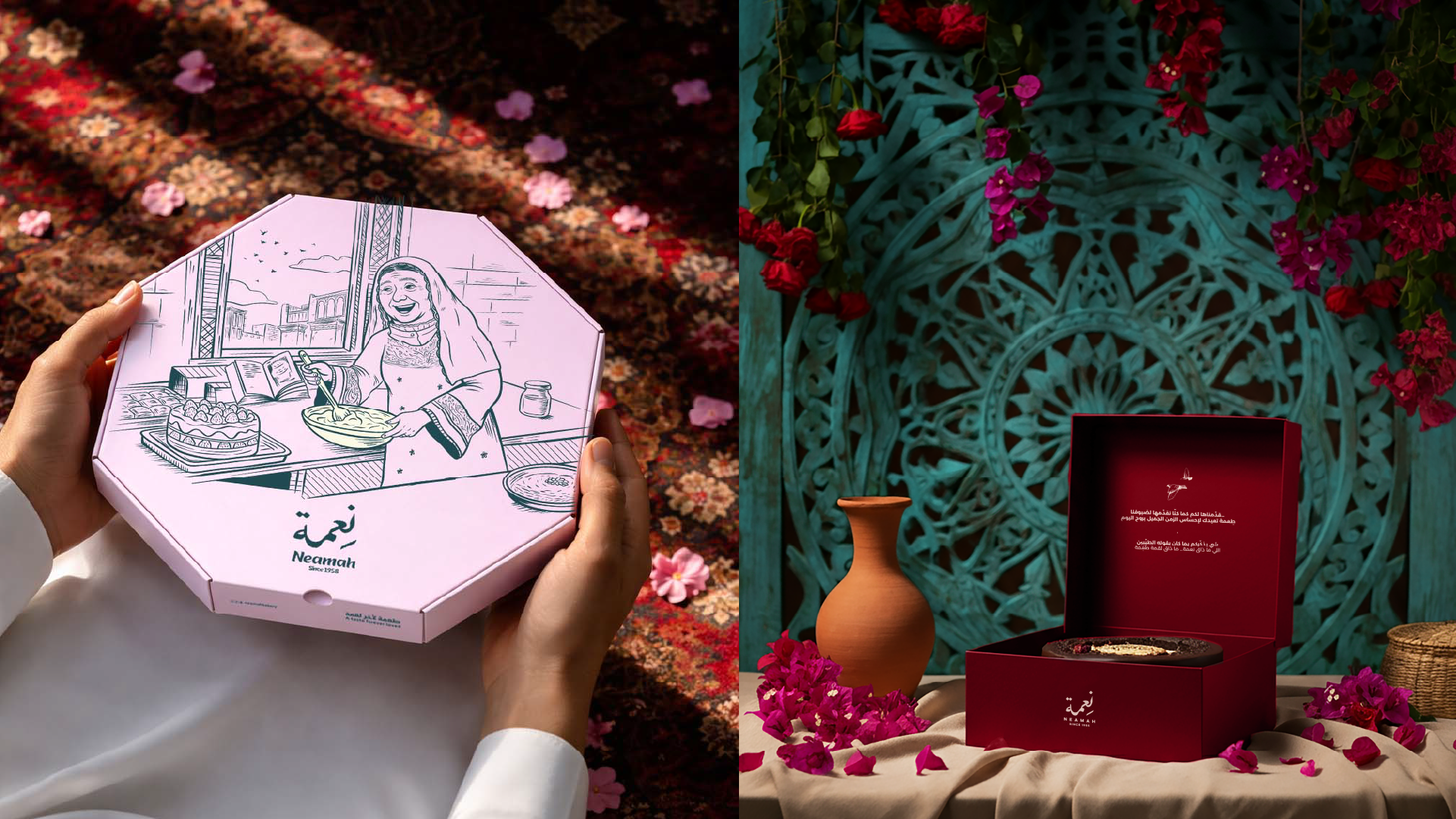
The visual identity of Neamah is built around an elegant Arabic logo, illustrative elements, botanical details, birds, and culturally inspired motifs. These components come together to create a warm and layered brand world that feels distinctive and easy to recognize. The identity was designed to shine across packaging and brand applications, turning each product into a visual extension of the brand’s story, rooted in care, beauty, and tradition.
Concept
Memory, generosity, and the value of sweets
The visual identity of Neamah is built around an elegant Arabic logo, illustrative elements, botanical details, birds, and culturally inspired motifs. These components come together to create a warm and layered brand world that feels distinctive and easy to recognize. The identity was designed to shine across packaging and brand applications, turning each product into a visual extension of the brand’s story, rooted in care, beauty, and tradition.
“Every pixel serves a purpose. Every interaction tells a story.”
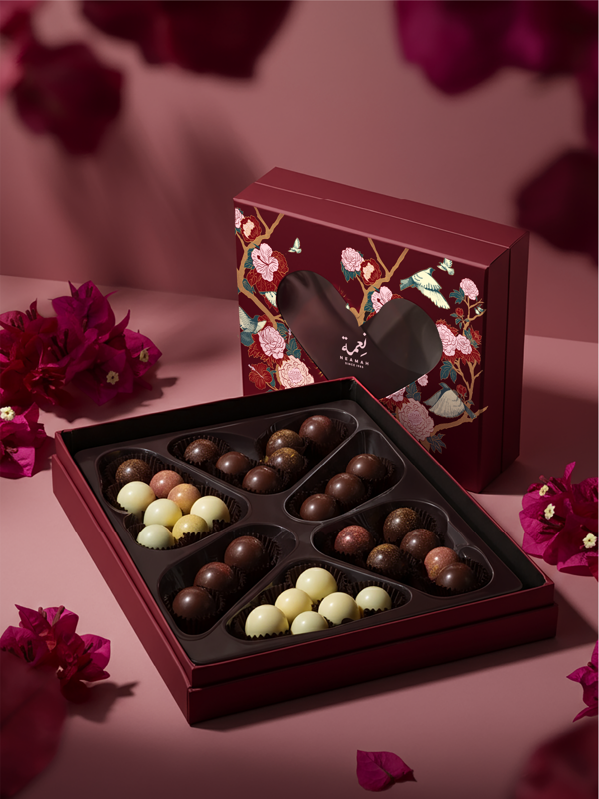
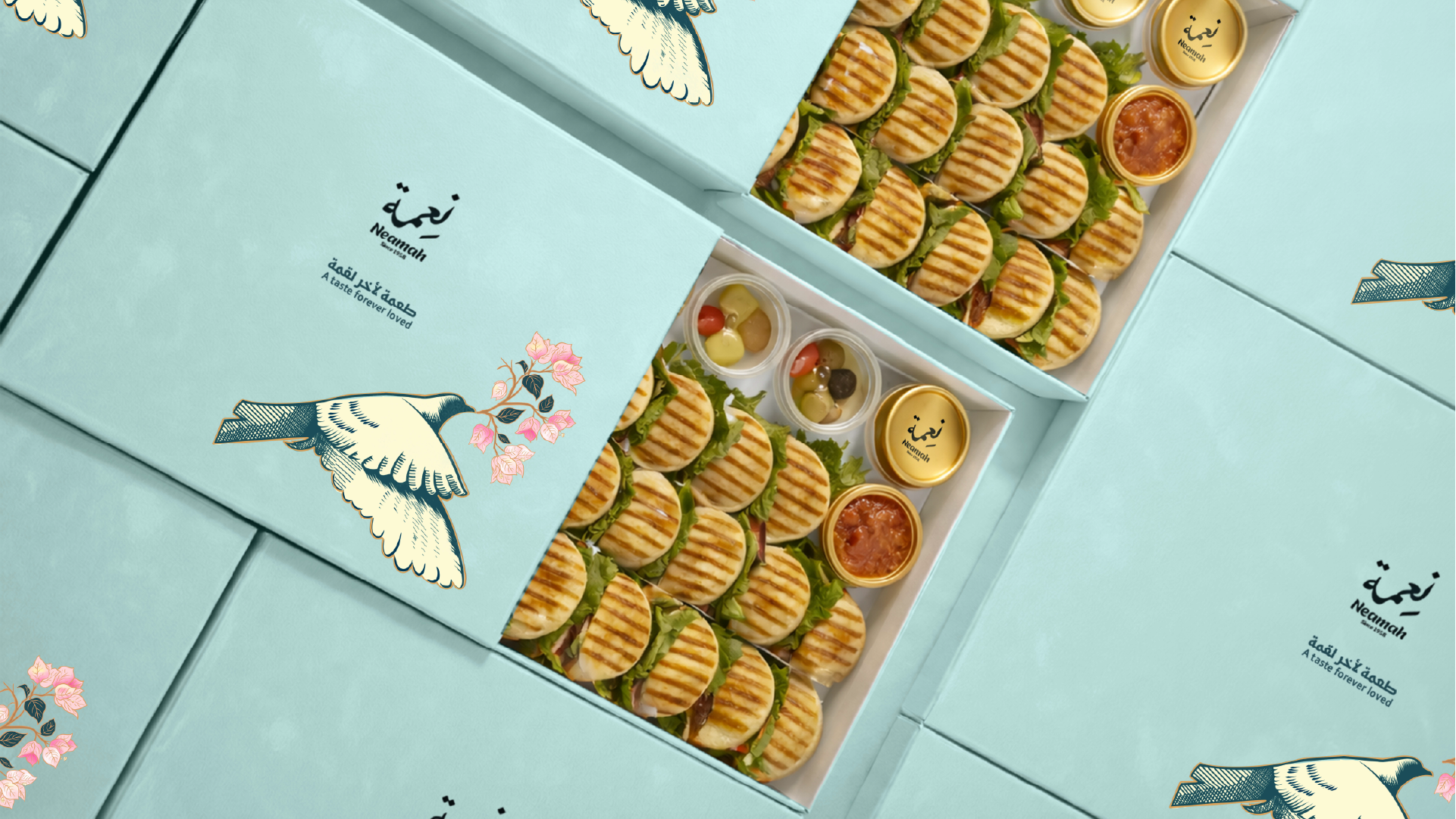
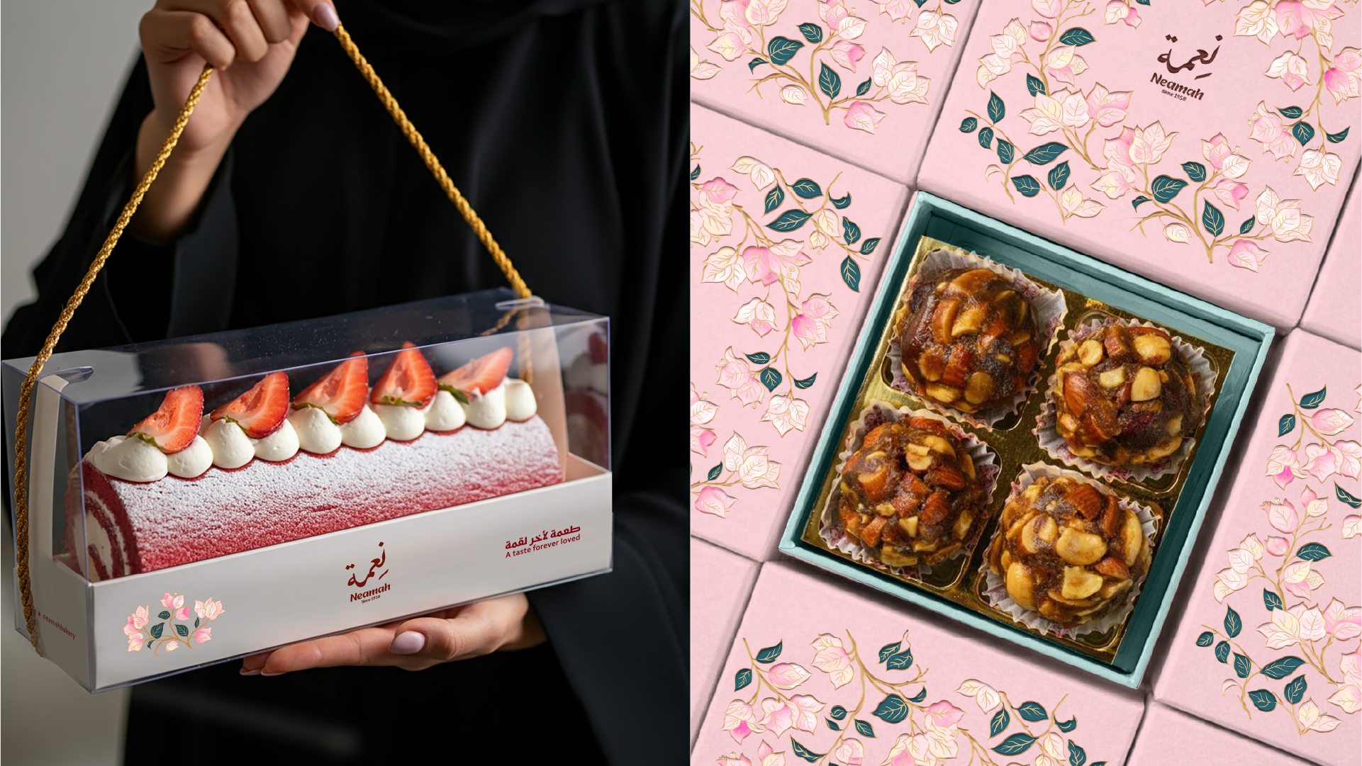
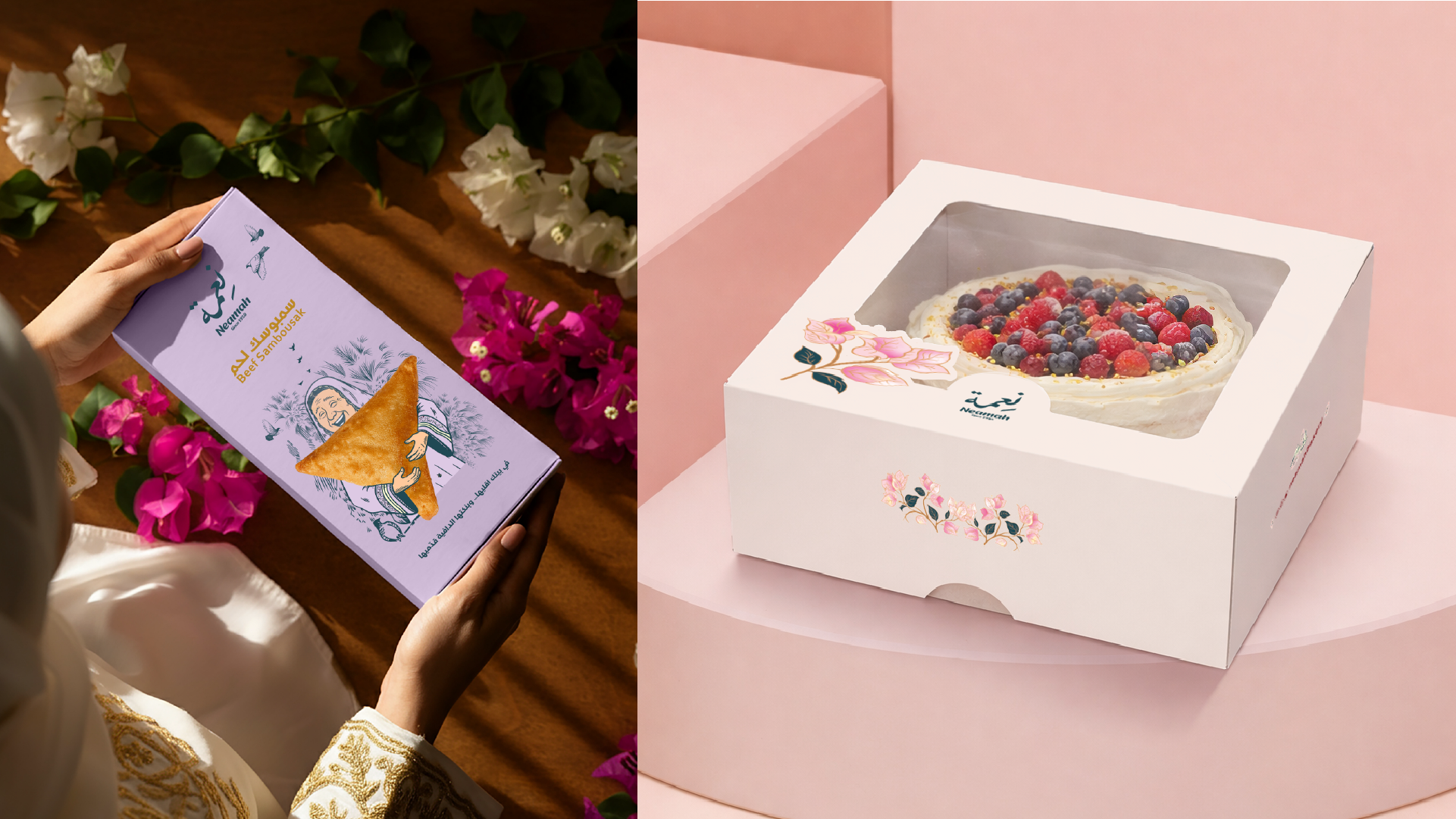
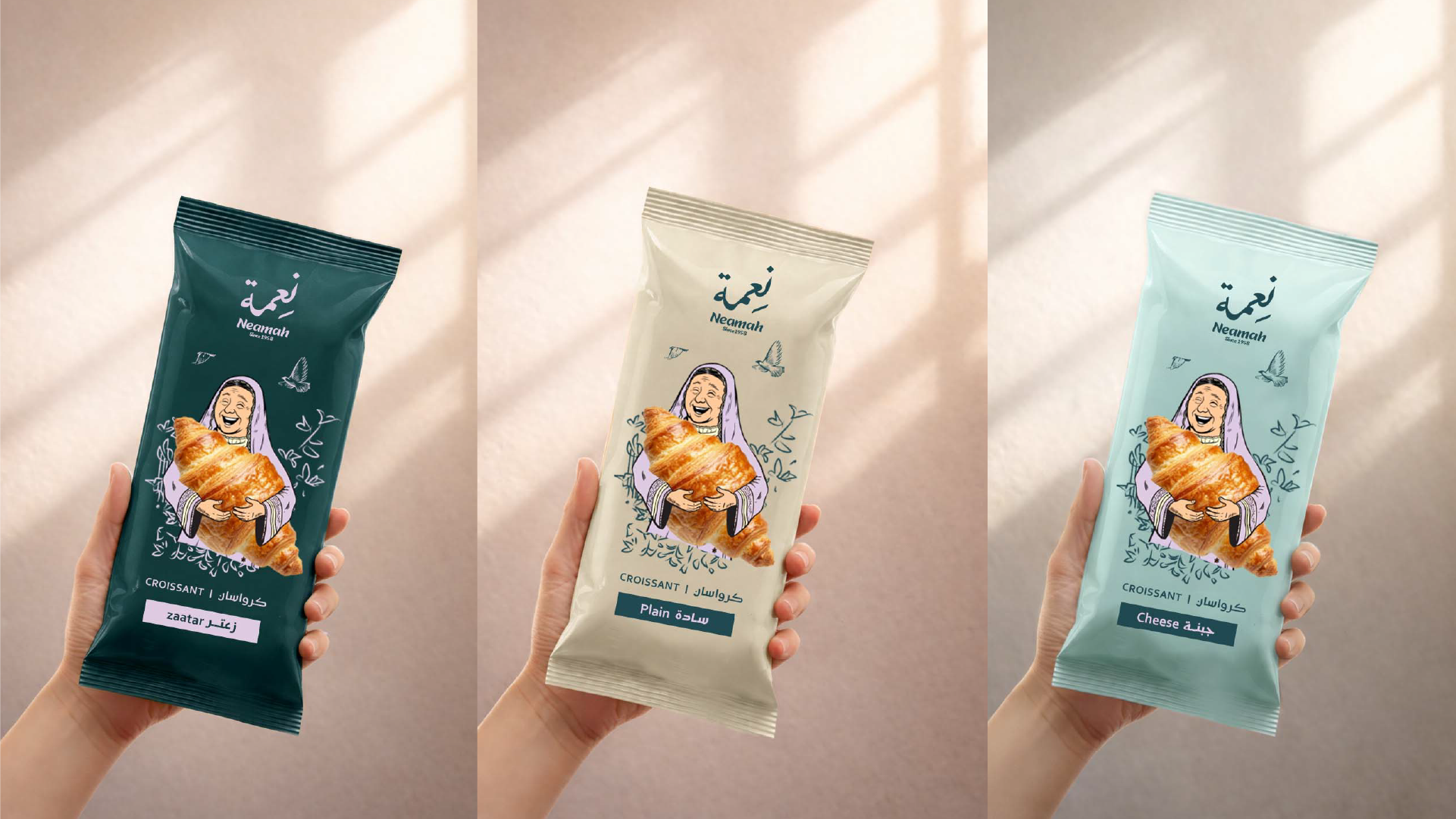
Identity System
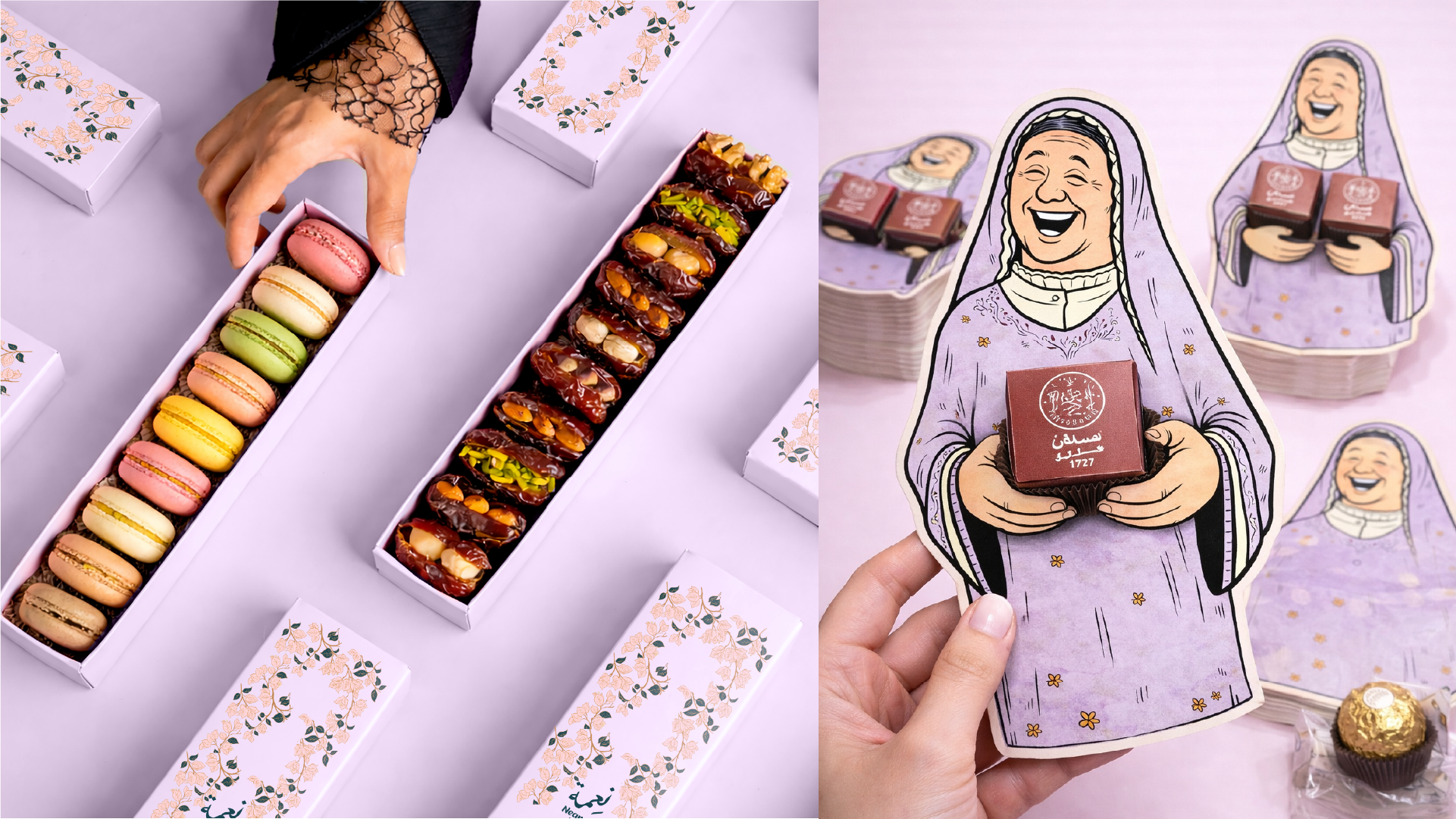
Floral motifs and a flexible packaging language
Floral illustration and soft-tone variants build a recognizable signature that can adapt across categories while staying cohesive.
The packaging language balances ornament with structure: consistent typography, clear hierarchy, and gold detailing for premium finish.
Identity System
Floral motifs and a flexible packaging language
Floral illustration and soft-tone variants build a recognizable signature that can adapt across categories while staying cohesive.
The packaging language balances ornament with structure: consistent typography, clear hierarchy, and gold detailing for premium finish.
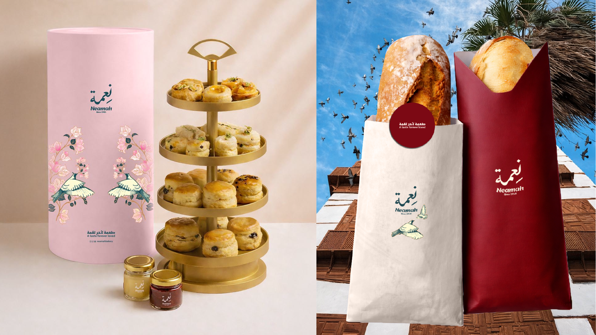
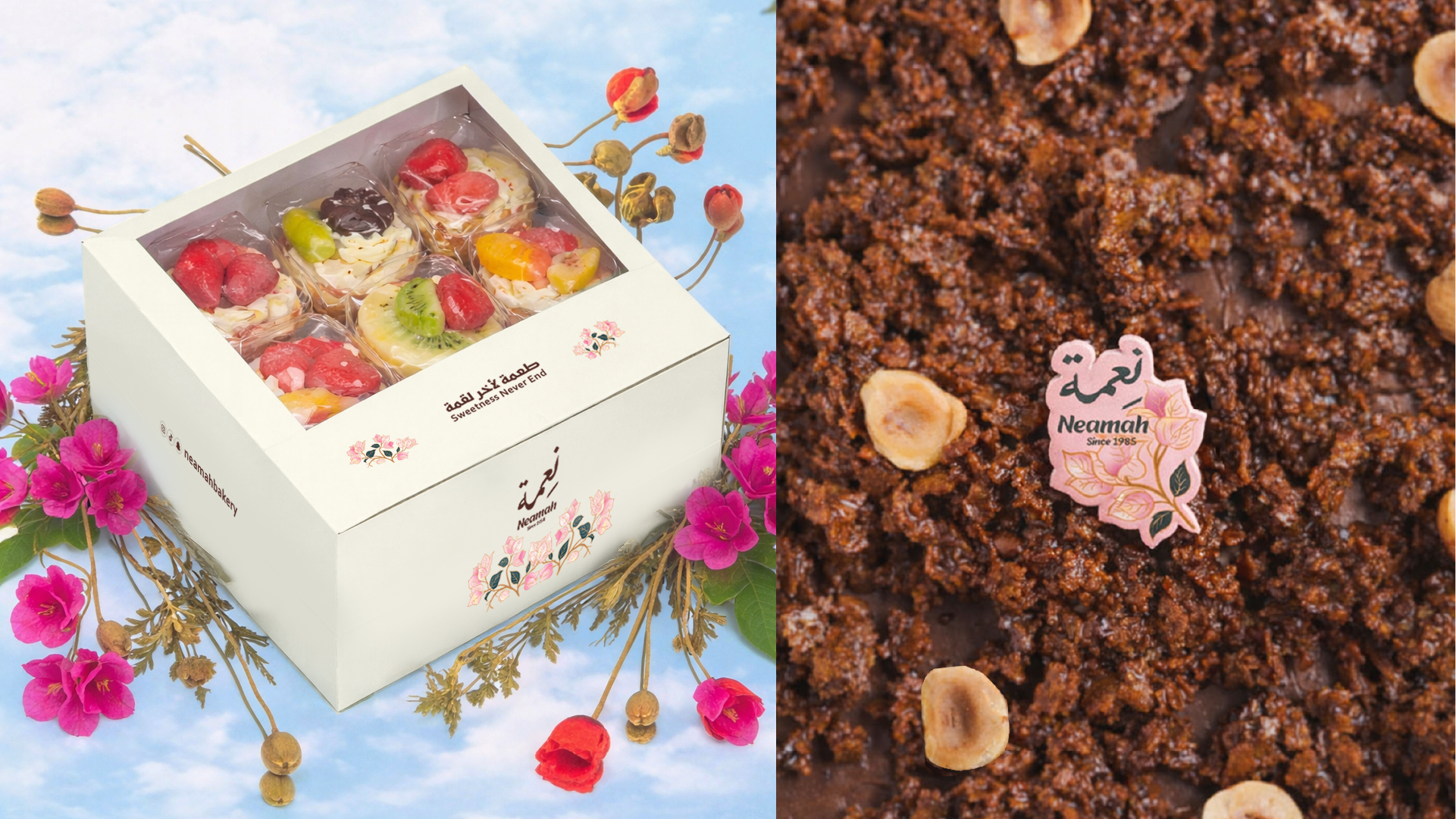
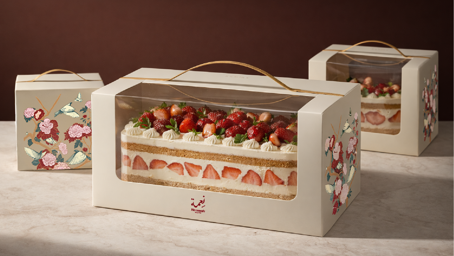
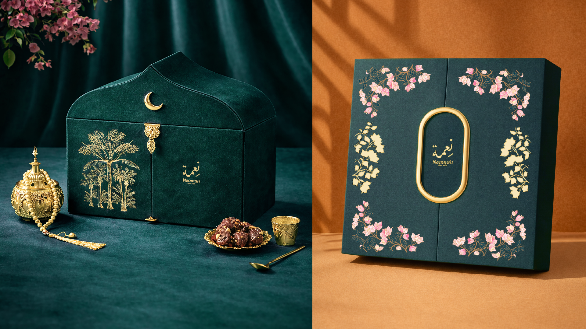
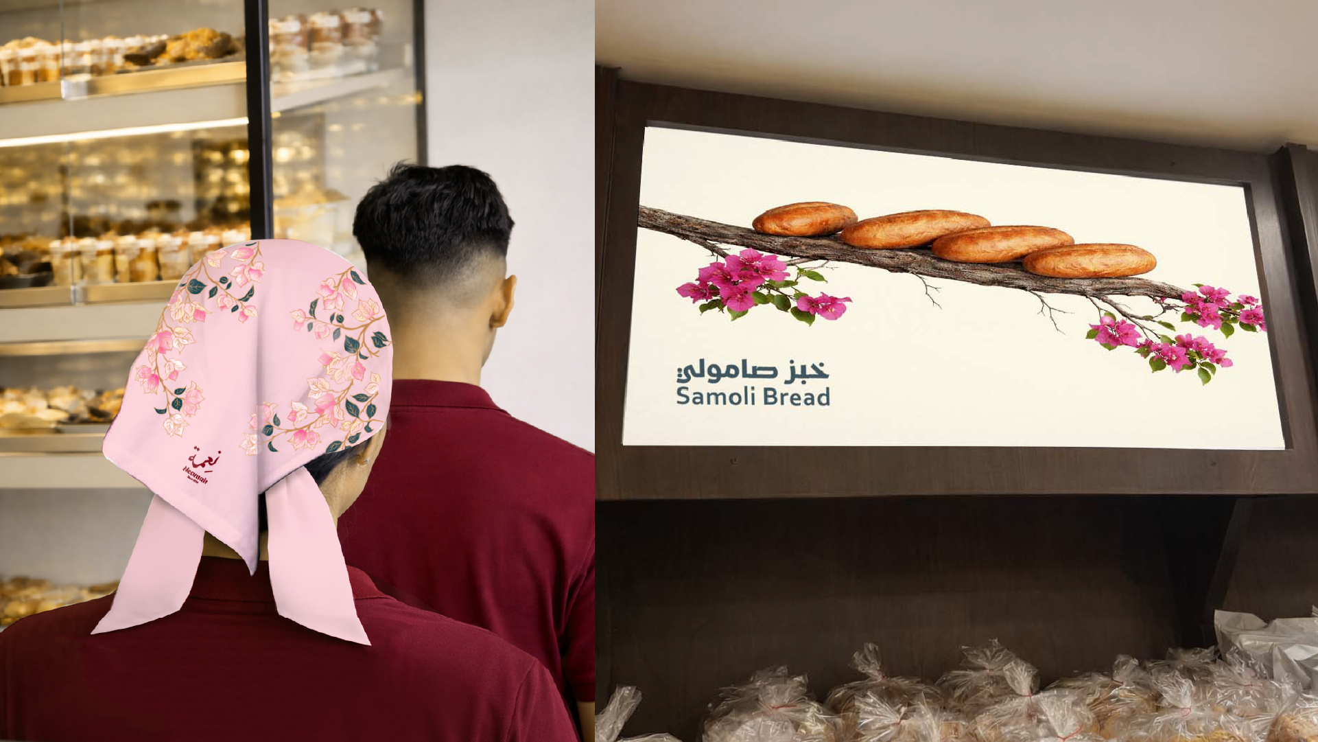
Brand In Use
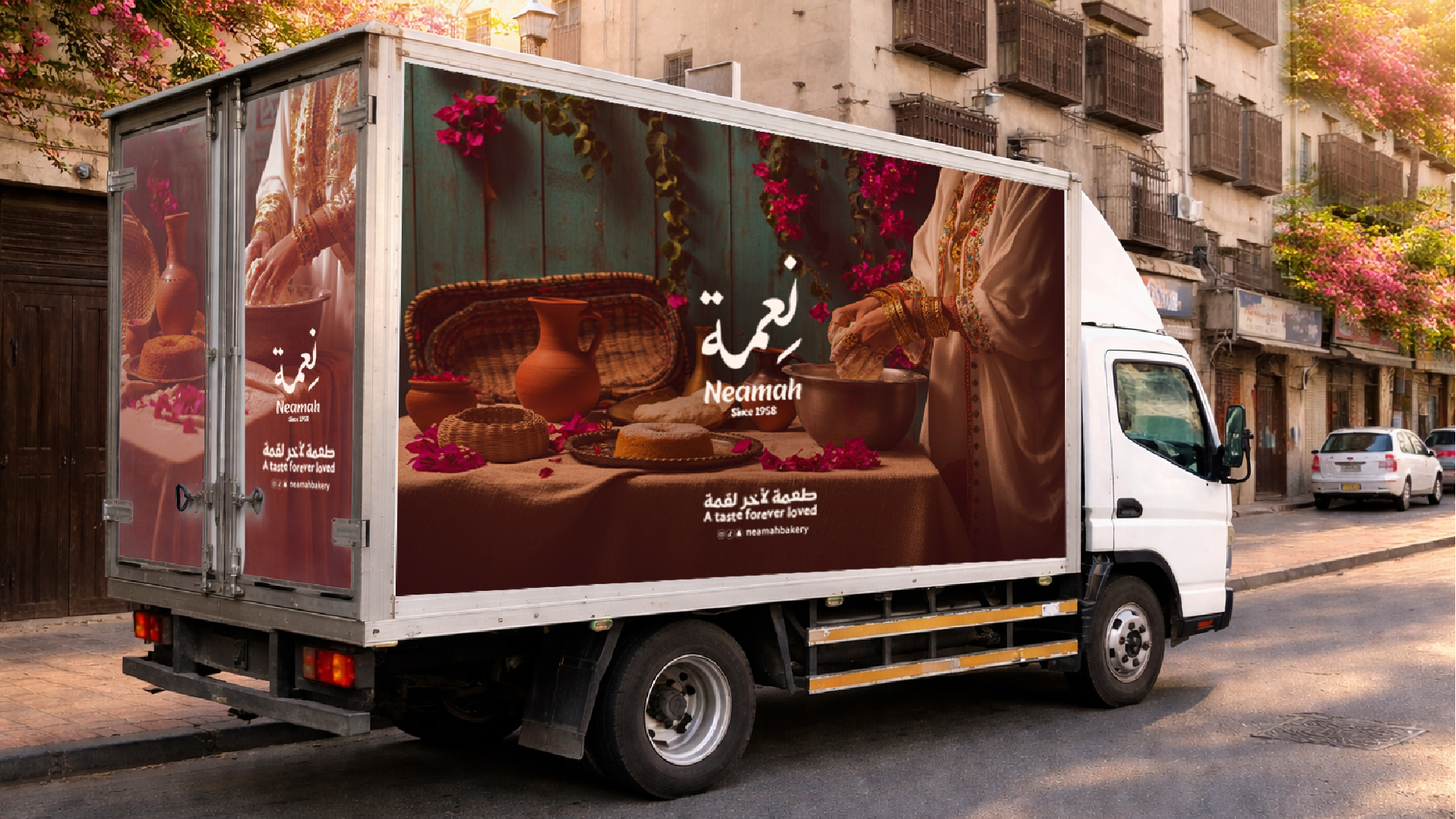
Premium gifting and retail presence
Applications focus on how the brand shows up in the world—on shelves, in seasonal moments, and in off-site gifting contexts.
The system supports everyday offerings and special releases with the same core voice, keeping the world cohesive and elevated.
Brand In Use
Premium gifting and retail presence
Applications focus on how the brand shows up in the world—on shelves, in seasonal moments, and in off-site gifting contexts.
The system supports everyday offerings and special releases with the same core voice, keeping the world cohesive and elevated.
The carefully curated palette that brings the digital experience to life.
Results & Impact
Project Impact
Key outcomes that define the project's success and lasting value.
1 of 3
Recall
Stronger recall through a distinctive heritage-led illustration system and color signature.
2 of 3
Consistency
Consistent expression across gifting, bakery, and retail packaging formats.
3 of 3
Flexibility
A premium identity that flexes across everyday and seasonal offerings without losing coherence.
Related projects
Services: Branding, Visual Identity, Packaging Direction, Art Direction