
WAHEDMAKHLOUT

WAHED MAKHLOUT
A tea brand shaped to feel rooted, warm, and instantly recognizable across takeaway and retail touchpoints.
WAHED MAKHLOUT builds a tea identity around warmth, ritual, and a single memorable blend—pairing expressive Arabic typography with a color-led system across packaging, cups, and campaign visuals.
Discovery
Understanding the core narrative, gathering requirements, and defining technical constraints.
Design
Crafting the visual language, typography scales, interactions, and motion curves.
Build
Developing the architecture and engineering the responsive frontend experience.
Launch
Performance optimization, accessibility audits, scaling, and final deployment.
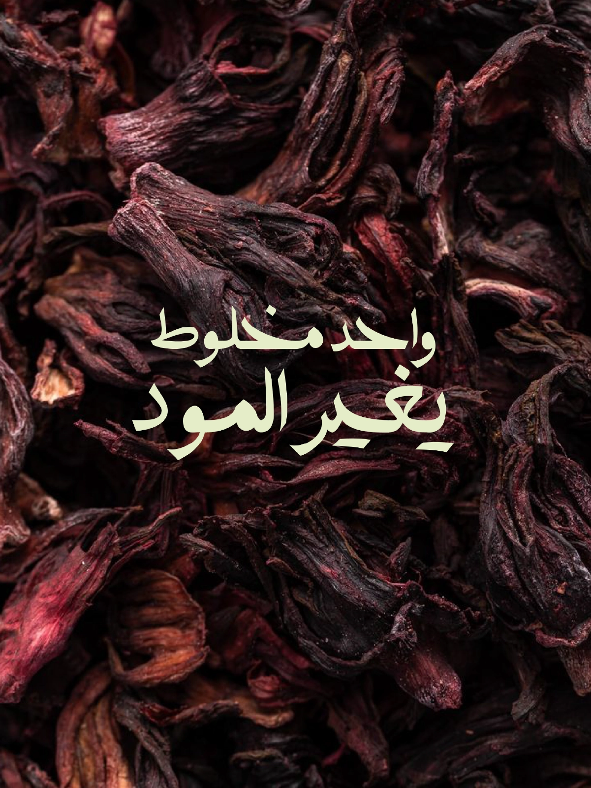
Concept
One blend, unmistakable presence
The concept stage focused on making the brand feel immediate and ownable: a single-blend thesis supported by a bold, color-led identity.
Expressive Arabic typography and simple graphic cues create a recognizable signature that stays consistent across packaging and campaigns.
“Every pixel serves a purpose. Every interaction tells a story.”
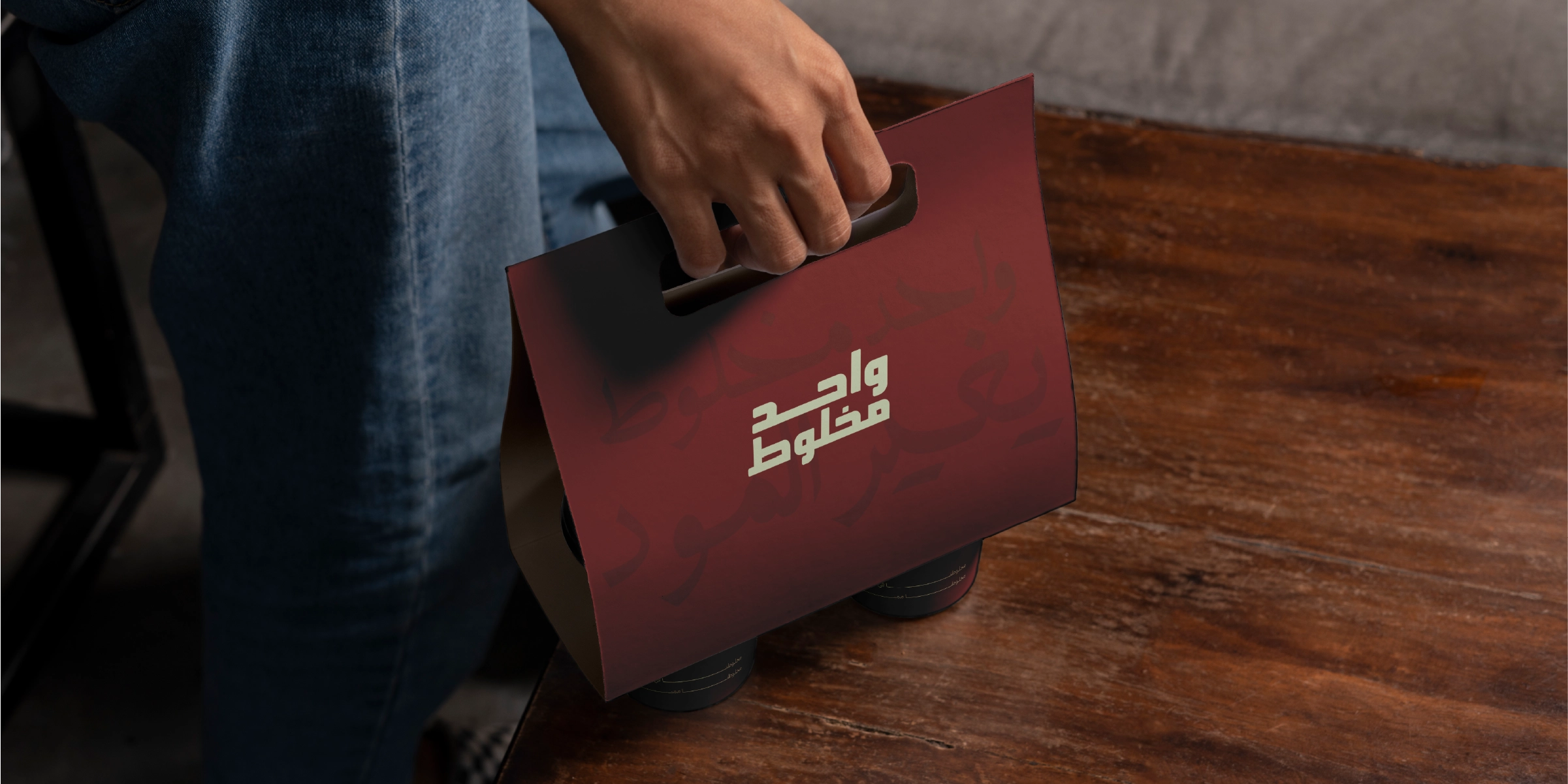
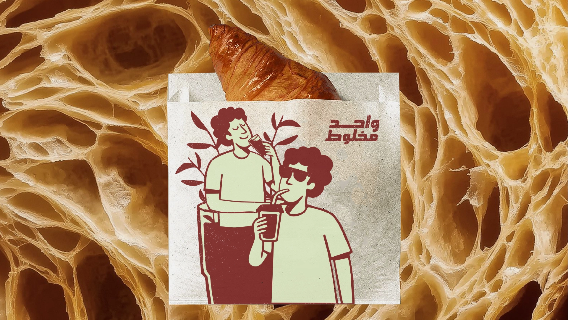
Identity System
Typography, carriers, and the hero pack
The identity system sets rules for how the mark, typography, and illustration elements behave across cups, carriers, and packaging.
The goal is clarity at speed—assets that read instantly in takeaway motion while staying rich enough for retail presence.
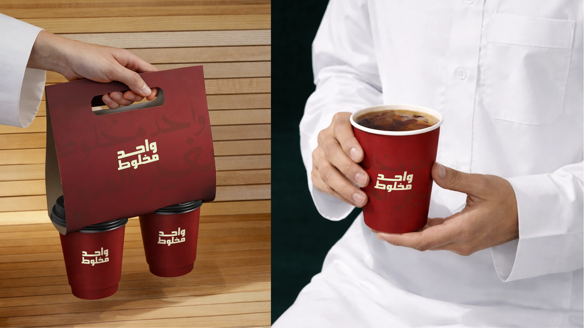
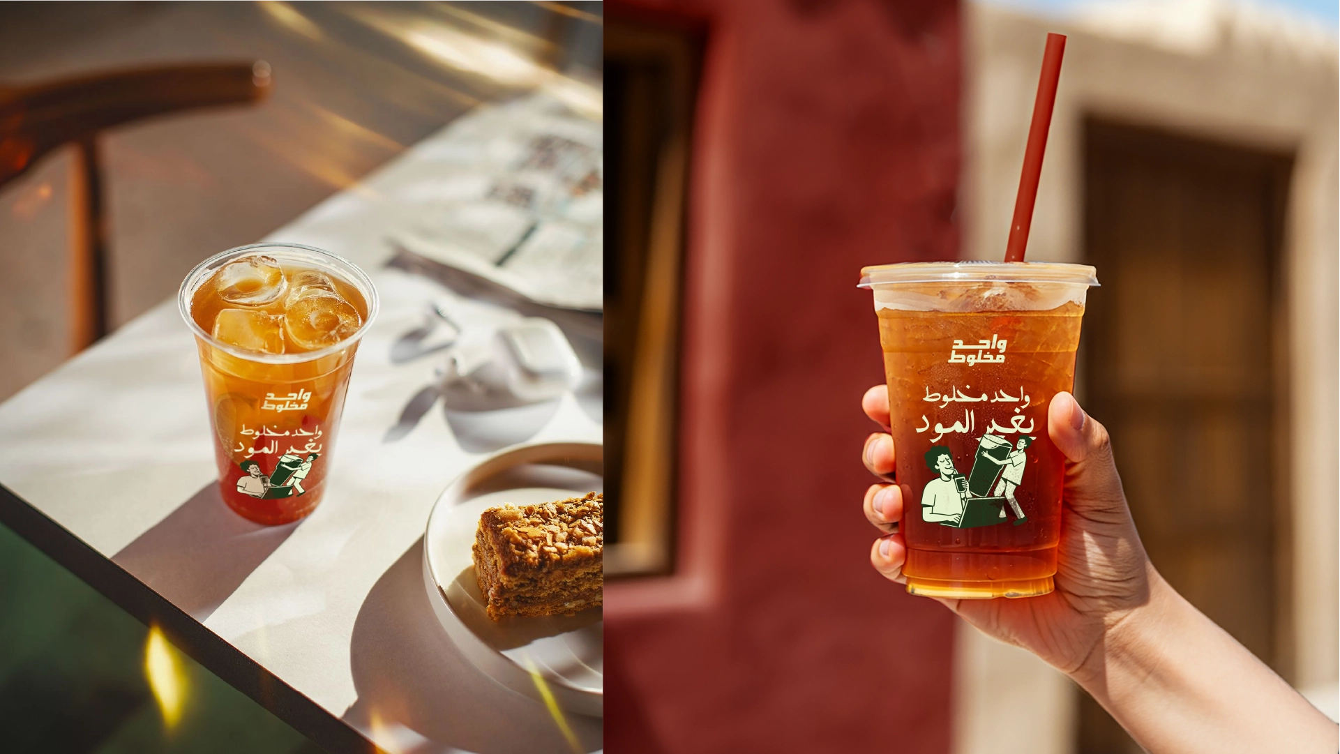
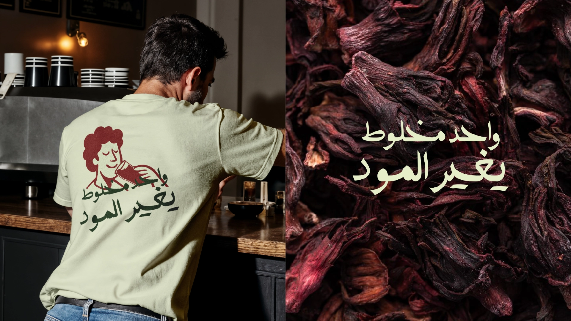
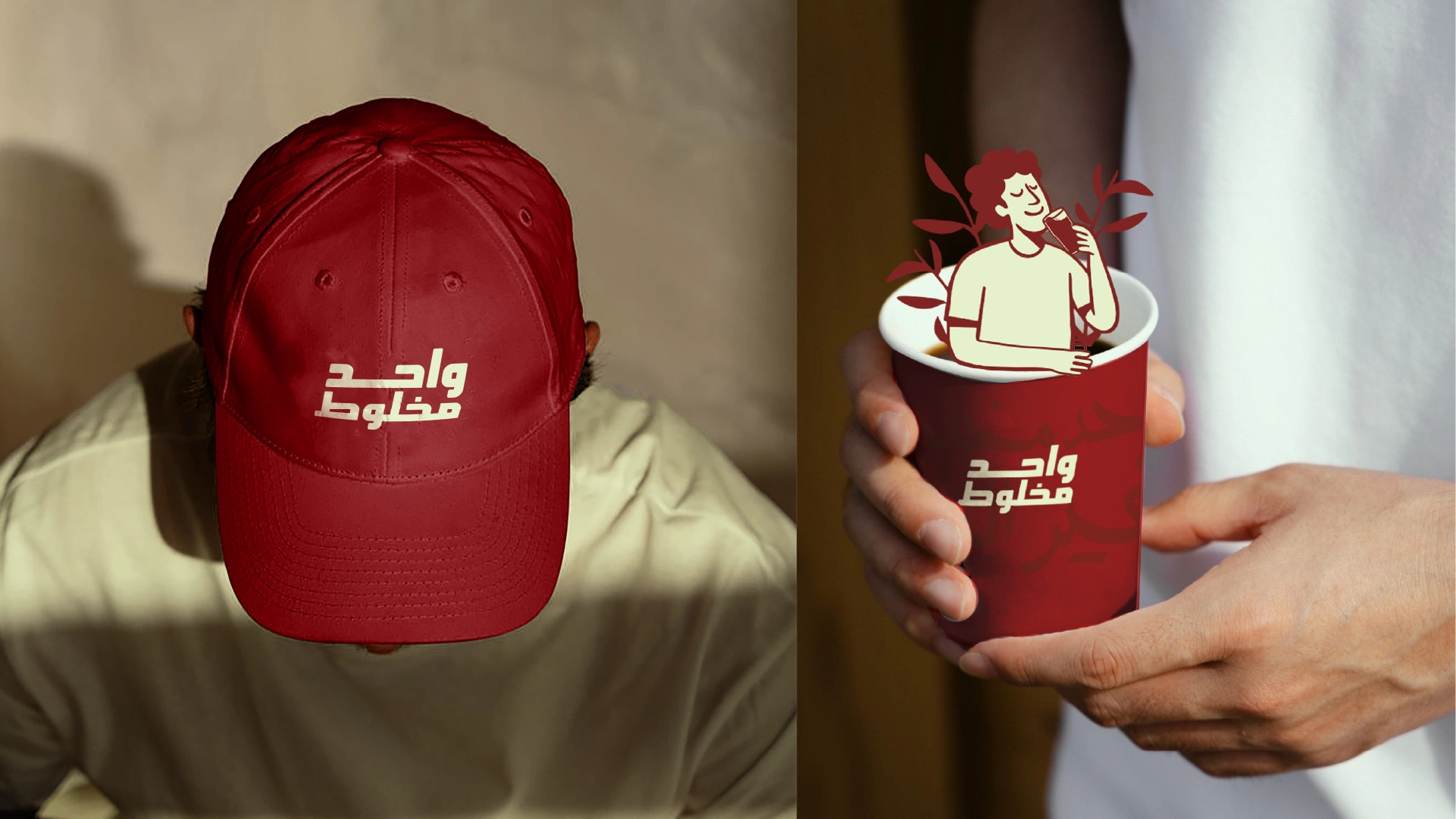
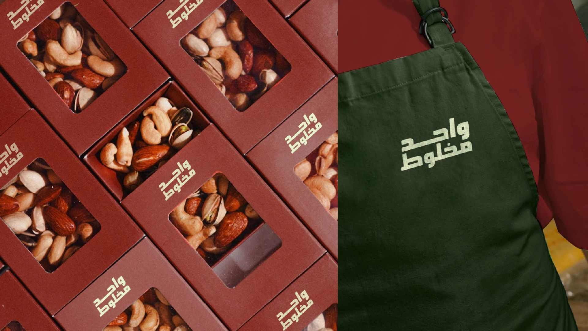
Brand In Use
Everyday touchpoints, consistent ritual
Brand-in-use applications prioritize the everyday: cups, carry trays, and packaging moments where repetition builds familiarity.
The system extends cleanly into merchandise and lifestyle imagery while keeping a warm, rooted tone.
Brand In Use
Everyday touchpoints, consistent ritual
Brand-in-use applications prioritize the everyday: cups, carry trays, and packaging moments where repetition builds familiarity.
The system extends cleanly into merchandise and lifestyle imagery while keeping a warm, rooted tone.
The carefully curated palette that brings the digital experience to life.
Results & Impact
Project Impact
Key outcomes that define the project's success and lasting value.
1 of 3
Recall
Stronger recall through a compact Arabic wordmark and a color-led identity system.
2 of 3
Consistency
A consistent brand presence across cups, packaging, and wearable applications.
3 of 3
Flexibility
A flexible visual language that supports both product communication and lifestyle imagery.
Related projects
Services: Branding, Visual Identity, Packaging Direction, Art Direction