
QPASTA

QPASTA
A pasta-and-pizza brand that feels cinematic, recognizable, and modern across dine‑in and takeaway touchpoints.
QPASTA blends Italian comfort-food cues with a sharper, contemporary bilingual identity—packaging, campaign assets, and a playful character system that carries from coffee to takeaway.

Discovery
Understanding the core narrative, gathering requirements, and defining technical constraints.
Design
Crafting the visual language, typography scales, interactions, and motion curves.
Build
Developing the architecture and engineering the responsive frontend experience.
Launch
Performance optimization, accessibility audits, scaling, and final deployment.
Concept
Italian references, edited for a modern brand
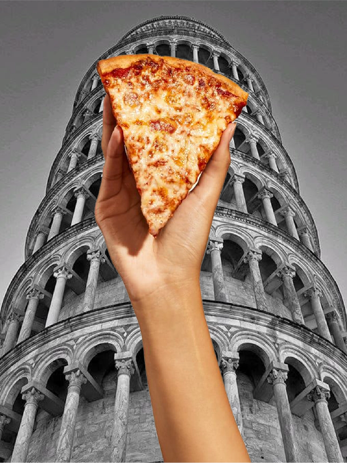
QPASTA was developed to offer an Italian dining experience with a lighter, friendlier, and more playful spirit. The goal was to build a brand that feels approachable, memorable, and full of personality, while still carrying clear Italian references. By blending classic Italian cues with a contemporary visual style, the brand became more relatable and engaging. The result is an identity that feels familiar, fun, and easy to connect with across different audiences.
Concept
Italian references, edited for a modern brand
QPASTA was developed to offer an Italian dining experience with a lighter, friendlier, and more playful spirit. The goal was to build a brand that feels approachable, memorable, and full of personality, while still carrying clear Italian references. By blending classic Italian cues with a contemporary visual style, the brand became more relatable and engaging. The result is an identity that feels familiar, fun, and easy to connect with across different audiences.
“Every pixel serves a purpose. Every interaction tells a story.”
Visual Identity
Logo behavior, character, and campaign assets
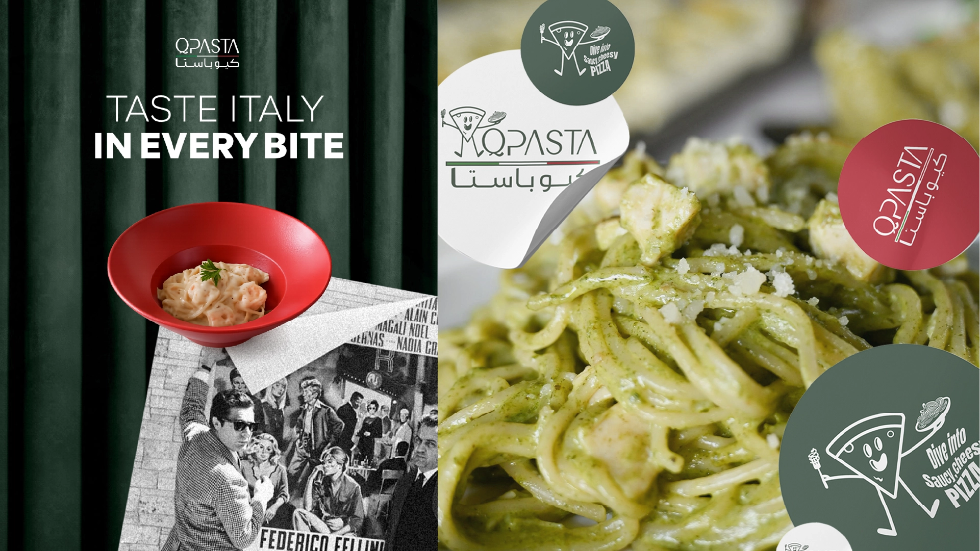
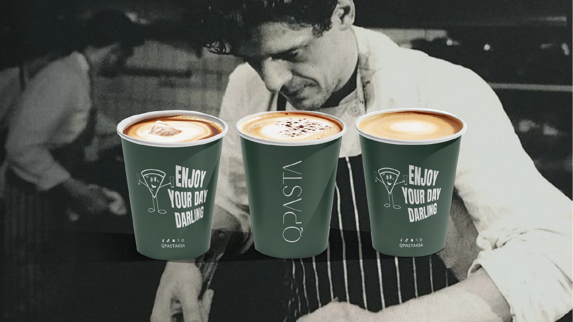
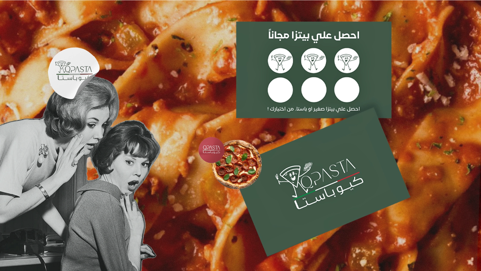
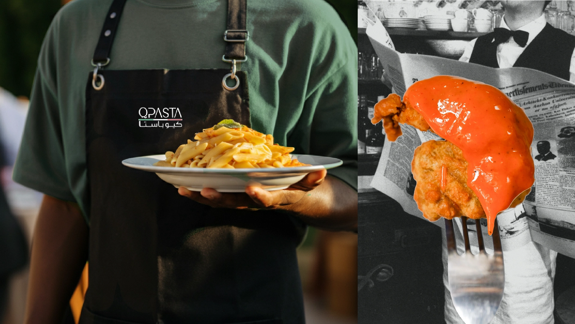
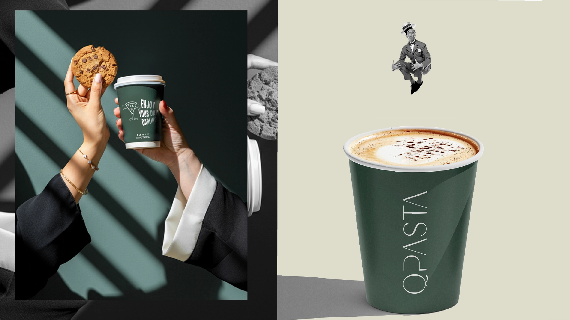
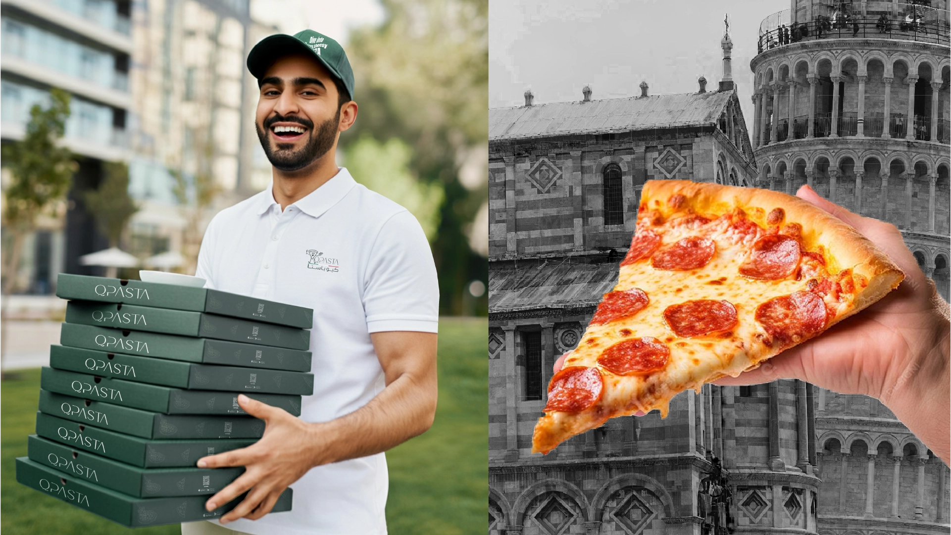
The visual identity of QPASTA is friendly, simple, and memorable. It combines a bilingual logo in Arabic and English with a playful character that gives the brand a more human and approachable feel. The system extends across packaging, cups, printed materials, and social content, allowing the brand to communicate its personality in a clear and engaging way. The overall identity is designed to be lively, accessible, and easy to remember.
Visual Identity
Logo behavior, character, and campaign assets
The visual identity of QPASTA is friendly, simple, and memorable. It combines a bilingual logo in Arabic and English with a playful character that gives the brand a more human and approachable feel. The system extends across packaging, cups, printed materials, and social content, allowing the brand to communicate its personality in a clear and engaging way. The overall identity is designed to be lively, accessible, and easy to remember.
Color System
QPASTA’s palette draws inspiration from Italian visual culture, using green and red as its primary anchors, supported by beige and white for clarity and balance. Dark green adds stability and depth, bright green brings freshness, and red introduces warmth and appetite appeal. Beige softens the palette, while white keeps the system clean and readable. Together, these colors create a vibrant and recognizable identity rooted in Italian character.
The carefully curated palette that brings the digital experience to life.
Results & Impact
Project Impact
Key outcomes that define the project's success and lasting value.
1 of 3
Recall
Stronger recall through a distinct bilingual mark and playful character system.
2 of 3
Flexibility
A flexible identity that spans pizza, pasta, coffee, and promotional touchpoints without losing coherence.
3 of 3
Storytelling
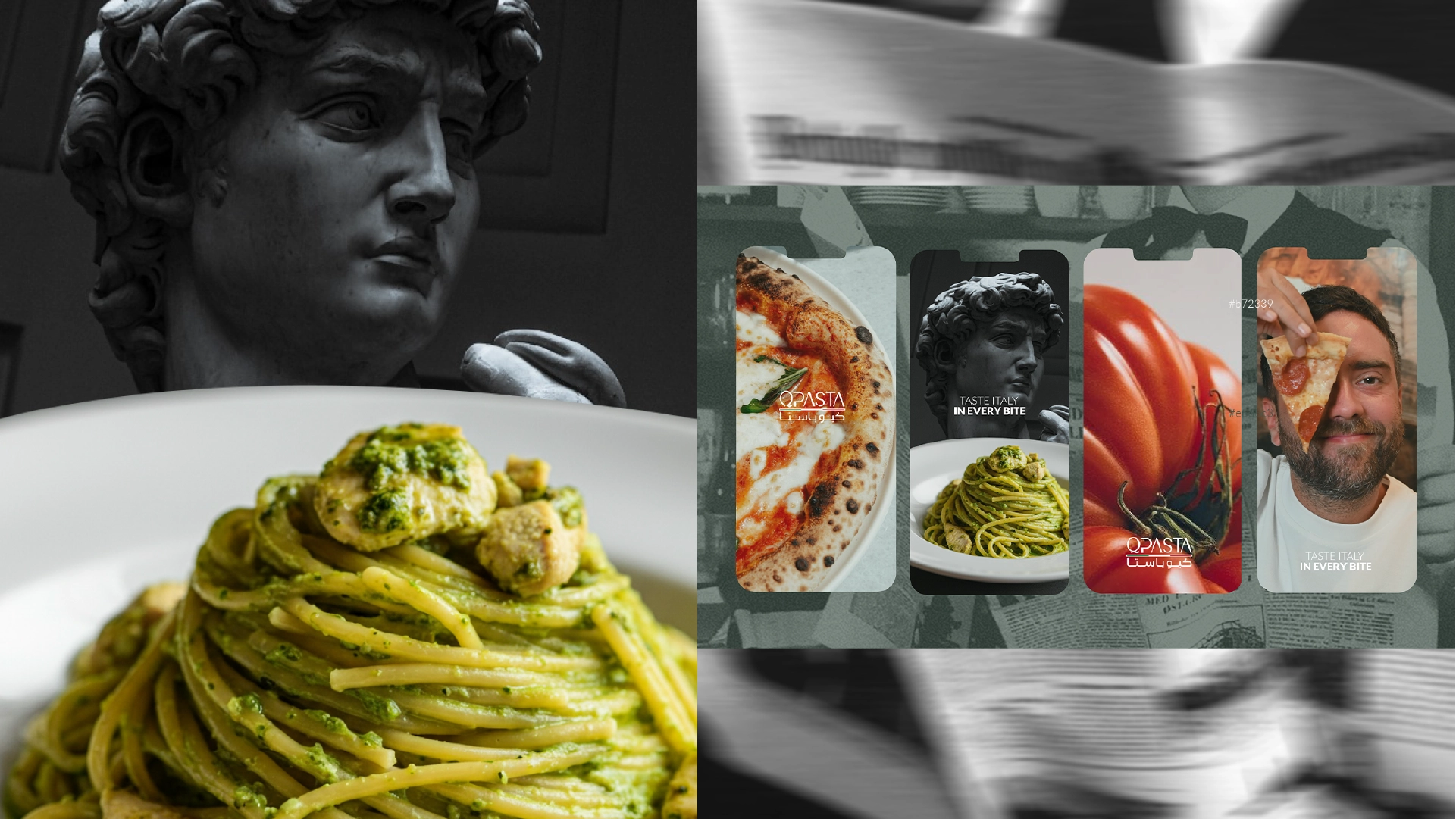
A clearer brand world connecting vivid product photography with editorial, cinematic framing.
Related projects
Services: Branding, Visual Identity, Packaging Direction, Art Direction