
CasaVerde
CASA VERDE
A natural lifestyle brand rooted in the warmth of home, the quiet of green spaces, and a palette drawn straight from the earth.
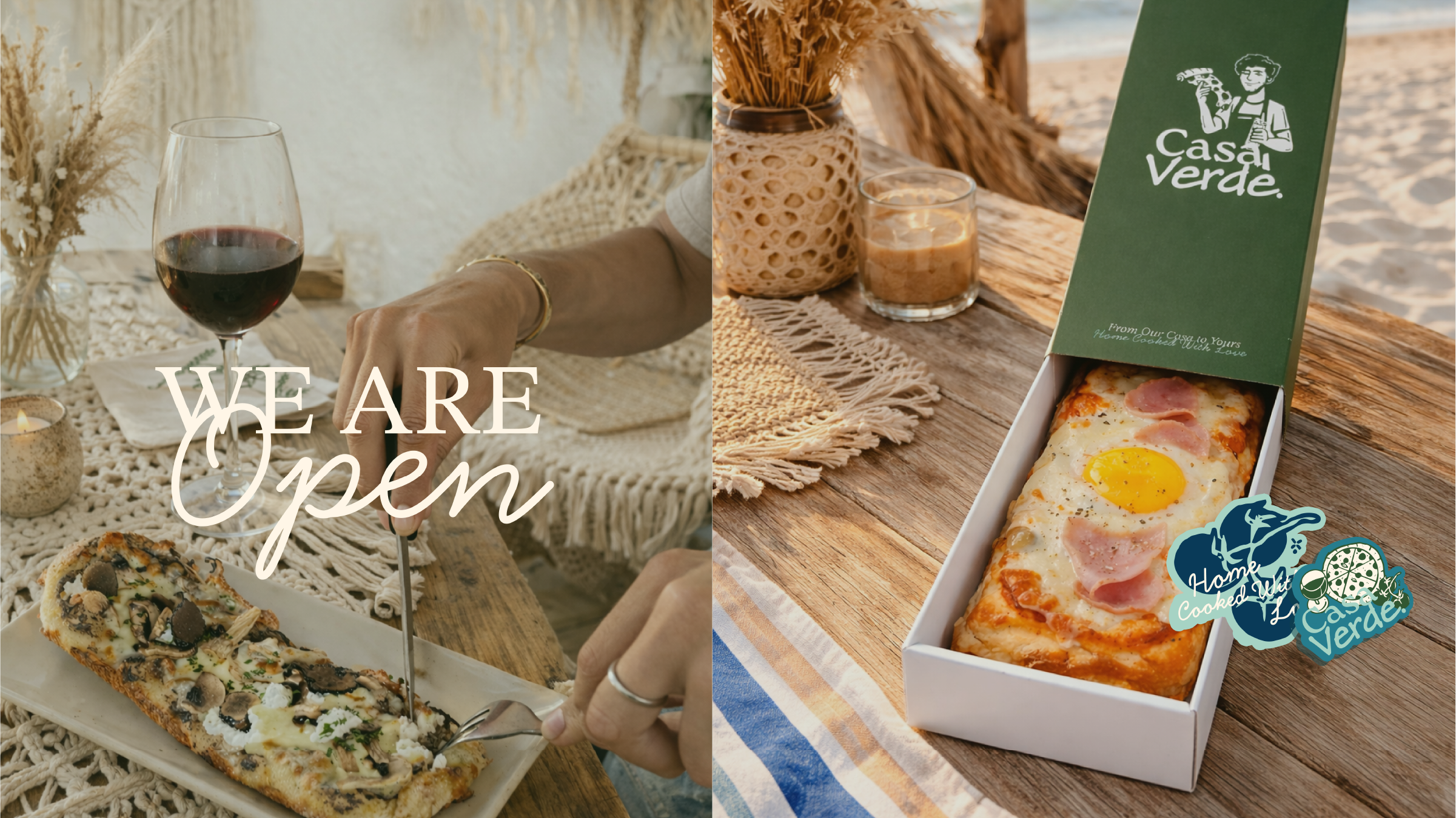
Casa Verde was created as more than just an Italian restaurant — it’s a tropical escape inspired by island life.
Discovery
Understanding the core narrative, gathering requirements, and defining technical constraints.
Design
Crafting the visual language, typography scales, interactions, and motion curves.
Build
Developing the architecture and engineering the responsive frontend experience.
Launch
Performance optimization, accessibility audits, scaling, and final deployment.
Concept
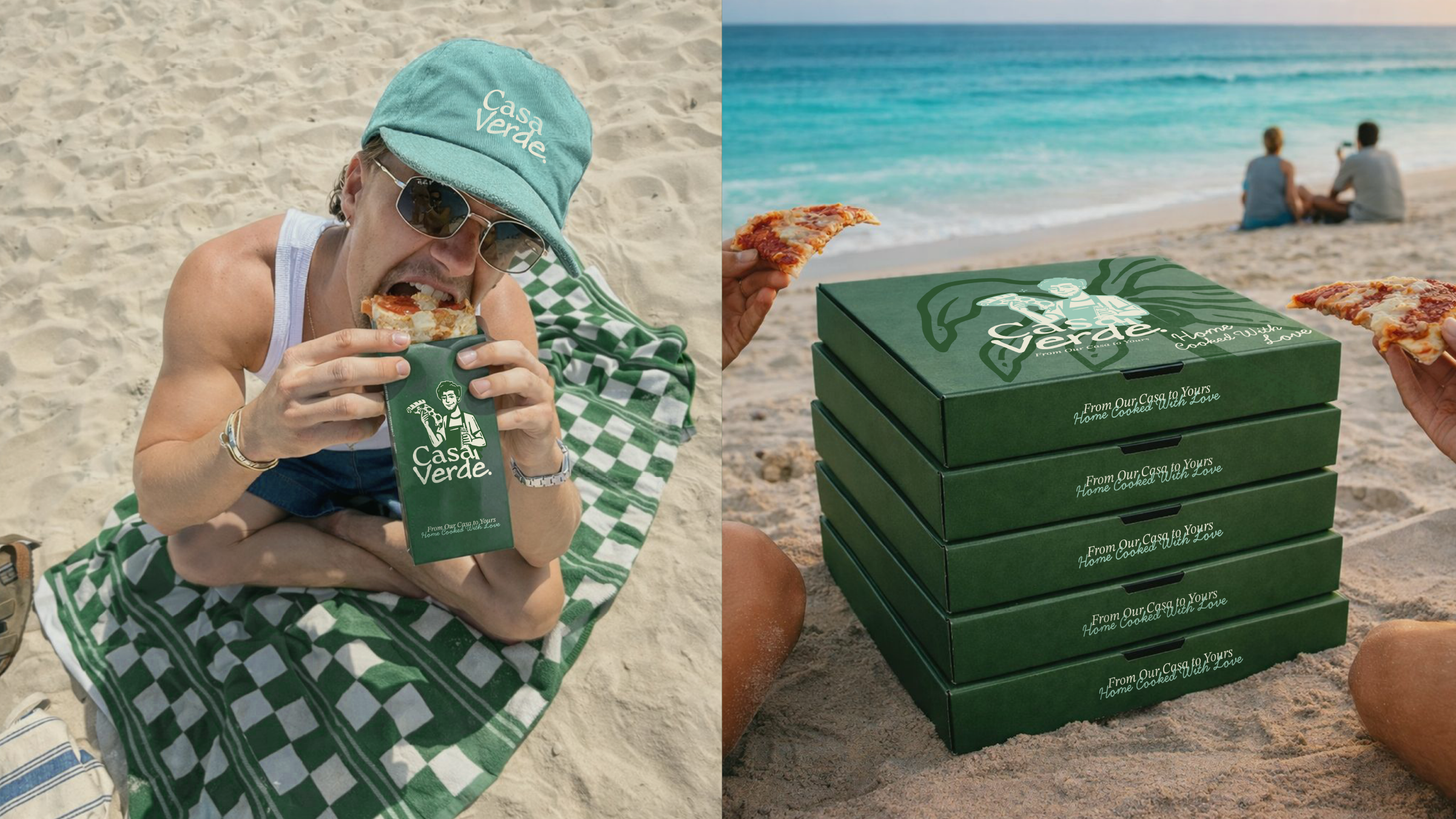
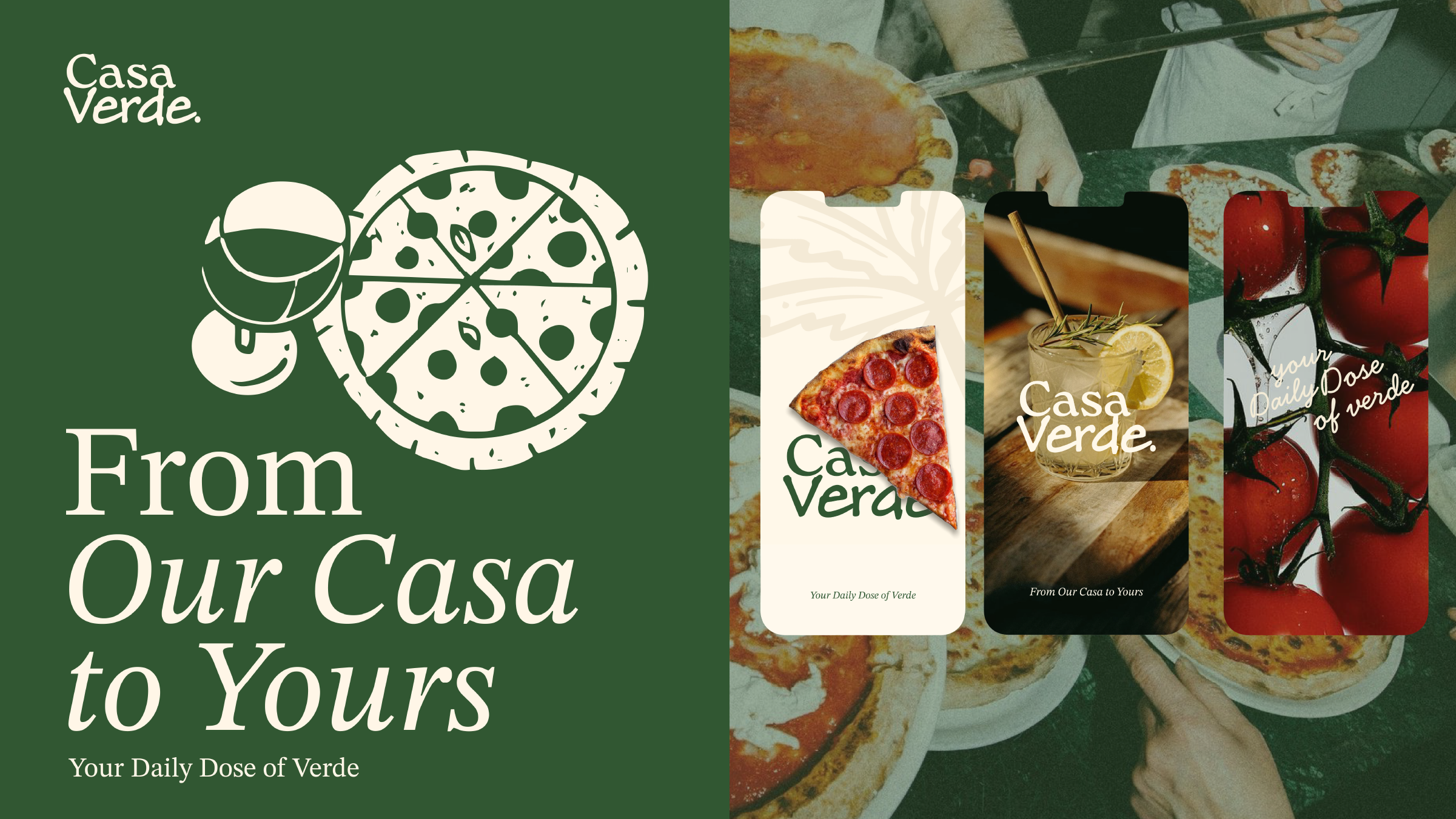
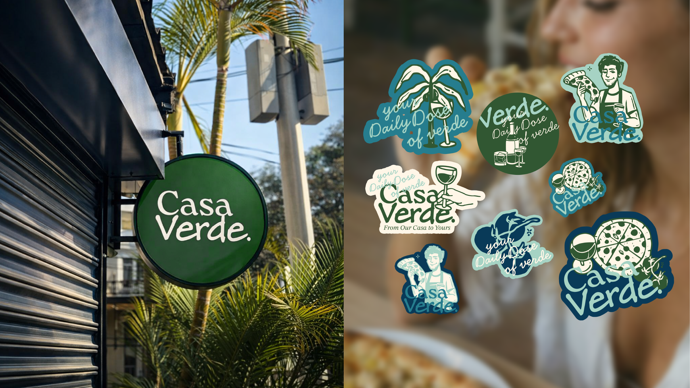
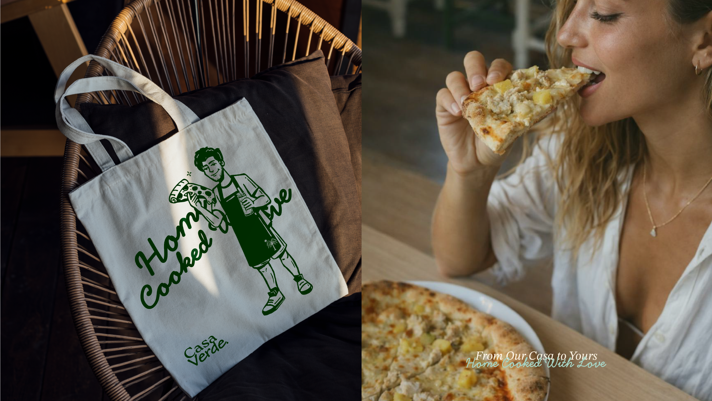
Located in the heart of Mauritius, Casa Verde was created as more than just an Italian restaurant — it’s a tropical escape inspired by island life, Mediterranean warmth, and the feeling of gathering around good food.
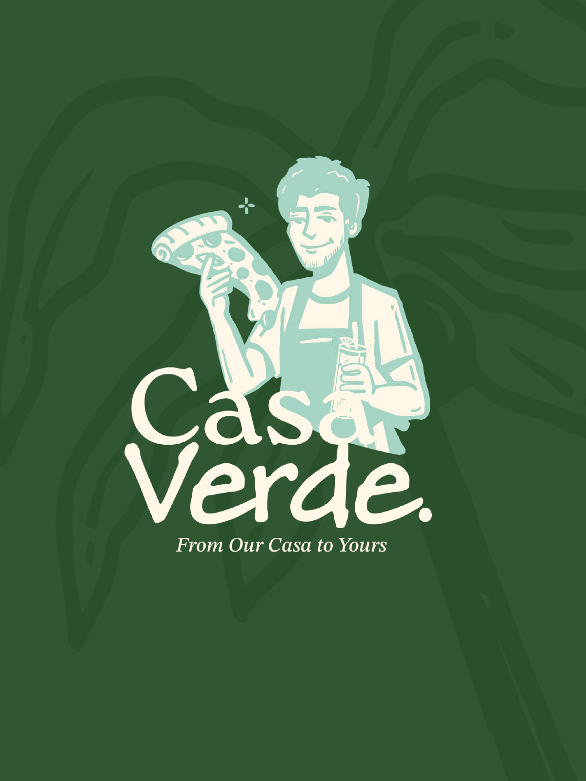
The branding blends Italian soul with the relaxed energy of Mauritius. From handmade typography inspired by pizza dough curves and sauce swirls, to warm earthy colors and ocean-inspired tones, every detail was designed to feel natural, welcoming, and full of personality. The Casa Verde color palette was inspired by the tropical nature of Mauritius and the calm elegance of Mediterranean culture.
Concept
Located in the heart of Mauritius, Casa Verde was created as more than just an Italian restaurant — it’s a tropical escape inspired by island life, Mediterranean warmth, and the feeling of gathering around good food.
The branding blends Italian soul with the relaxed energy of Mauritius. From handmade typography inspired by pizza dough curves and sauce swirls, to warm earthy colors and ocean-inspired tones, every detail was designed to feel natural, welcoming, and full of personality. The Casa Verde color palette was inspired by the tropical nature of Mauritius and the calm elegance of Mediterranean culture.
“Every pixel serves a purpose. Every interaction tells a story.”
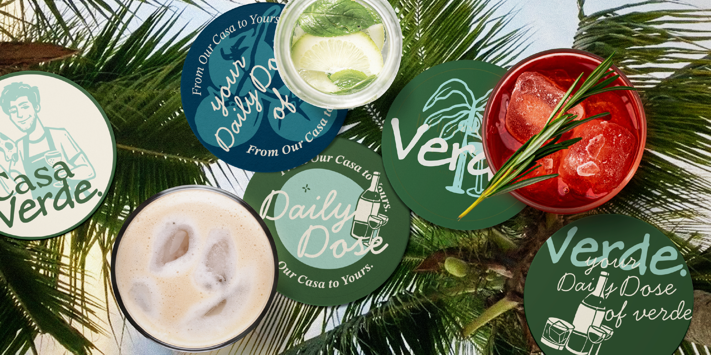
Color System
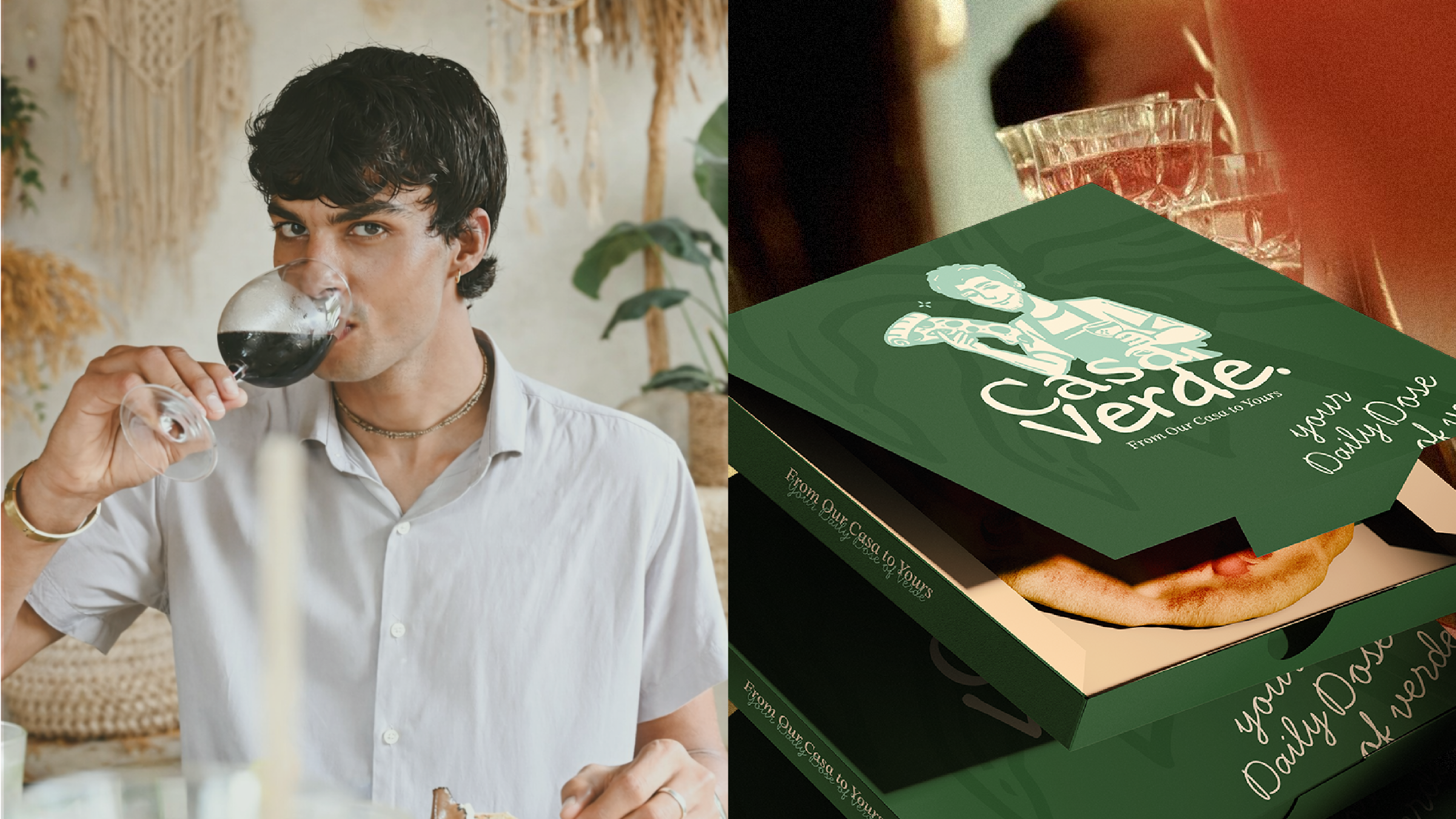
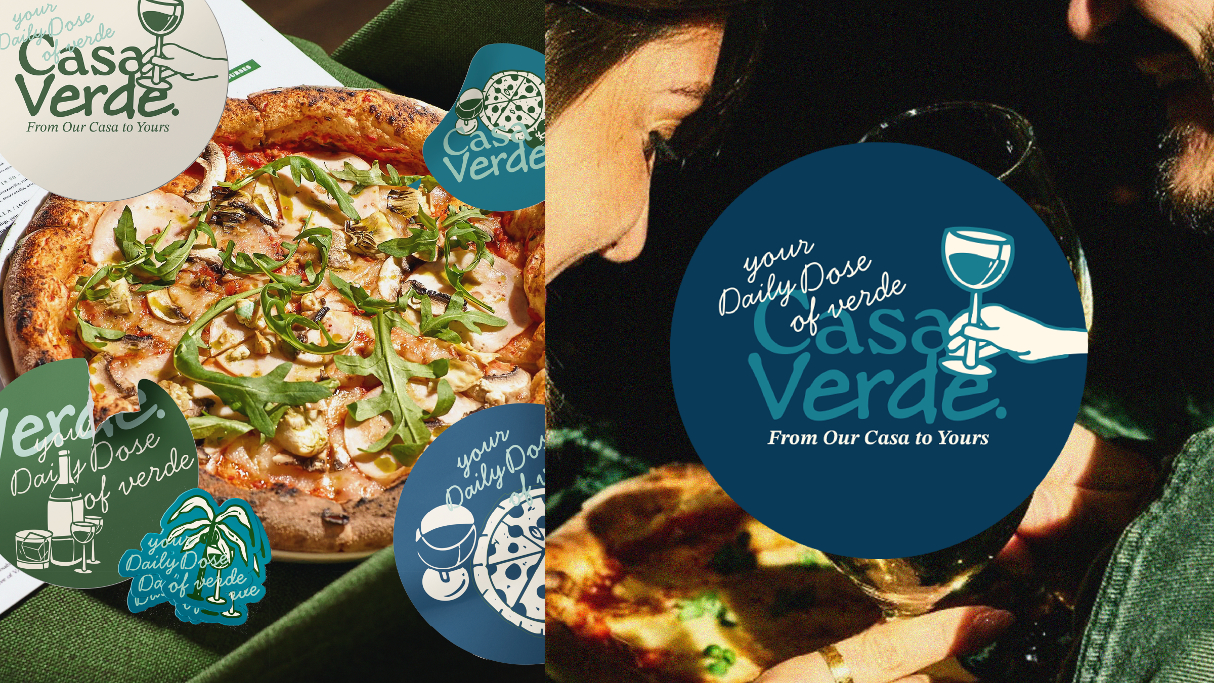
The Casa Verde color palette was inspired by the tropical nature of Mauritius and the calm elegance of Mediterranean culture. Deep Green — represents nature, freshness, and the “Verde” identity. Coconut Beige — adds warmth, softness, and a cozy handcrafted feeling. Reef Turquoise — inspired by crystal-clear island waters and tropical energy. Ocean Navy — reflects depth, elegance, and the Indian Ocean surrounding Mauritius. Together, the palette creates a balance between earthy warmth and coastal freshness
Color System
The Casa Verde color palette was inspired by the tropical nature of Mauritius and the calm elegance of Mediterranean culture. Deep Green — represents nature, freshness, and the “Verde” identity. Coconut Beige — adds warmth, softness, and a cozy handcrafted feeling. Reef Turquoise — inspired by crystal-clear island waters and tropical energy. Ocean Navy — reflects depth, elegance, and the Indian Ocean surrounding Mauritius. Together, the palette creates a balance between earthy warmth and coastal freshness
The carefully curated palette that brings the digital experience to life.
Results & Impact
Project Impact
Key outcomes that define the project's success and lasting value.
1 of 3
Coherence
A system where color, form, and texture speak one language.
2 of 3
Warmth
A palette that feels lived-in rather than chosen.
3 of 3
Versatility
An identity that scales from packaging to digital without losing itself.
Related projects
Services: Branding, Visual Identity, Color System
Deliverables: Identity toolkit, packaging, digital assets
Studio: Creative Core