
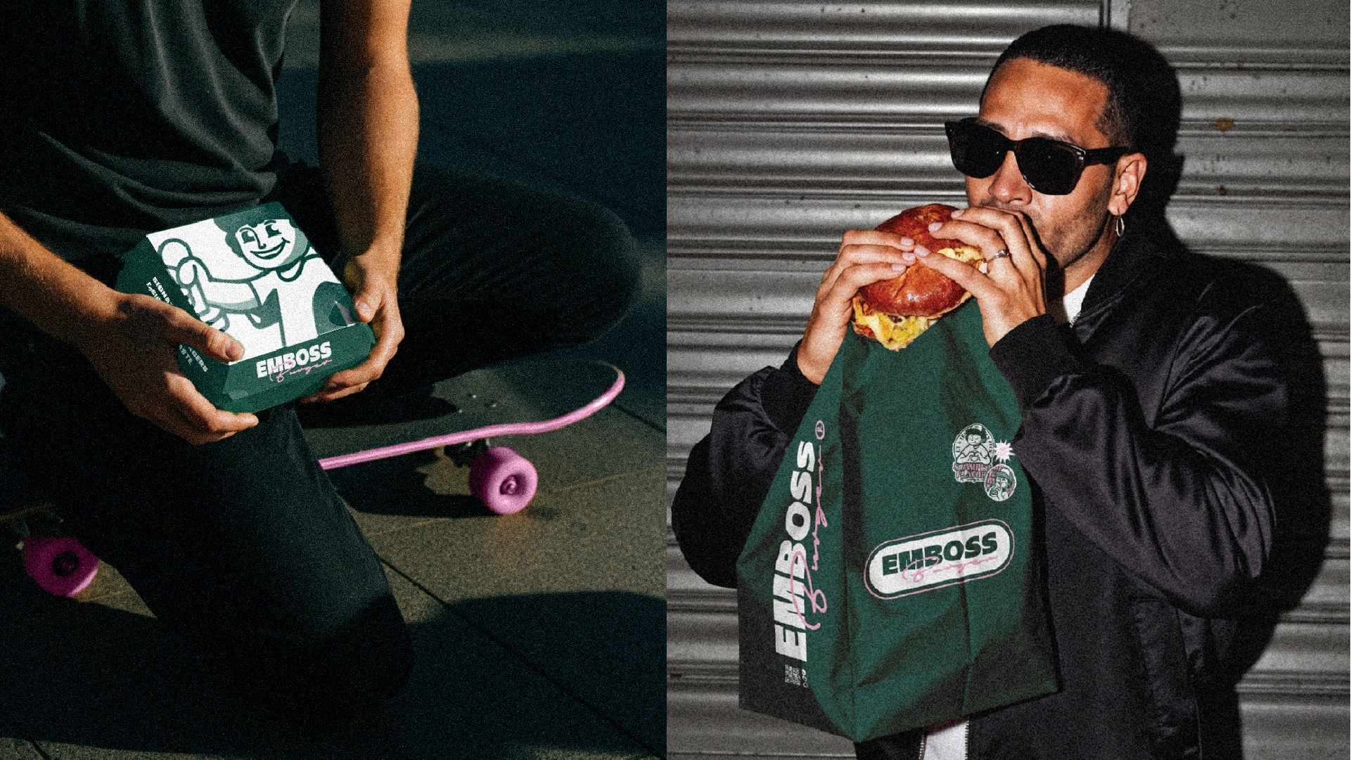
EmbossBurger
Emboss Burger
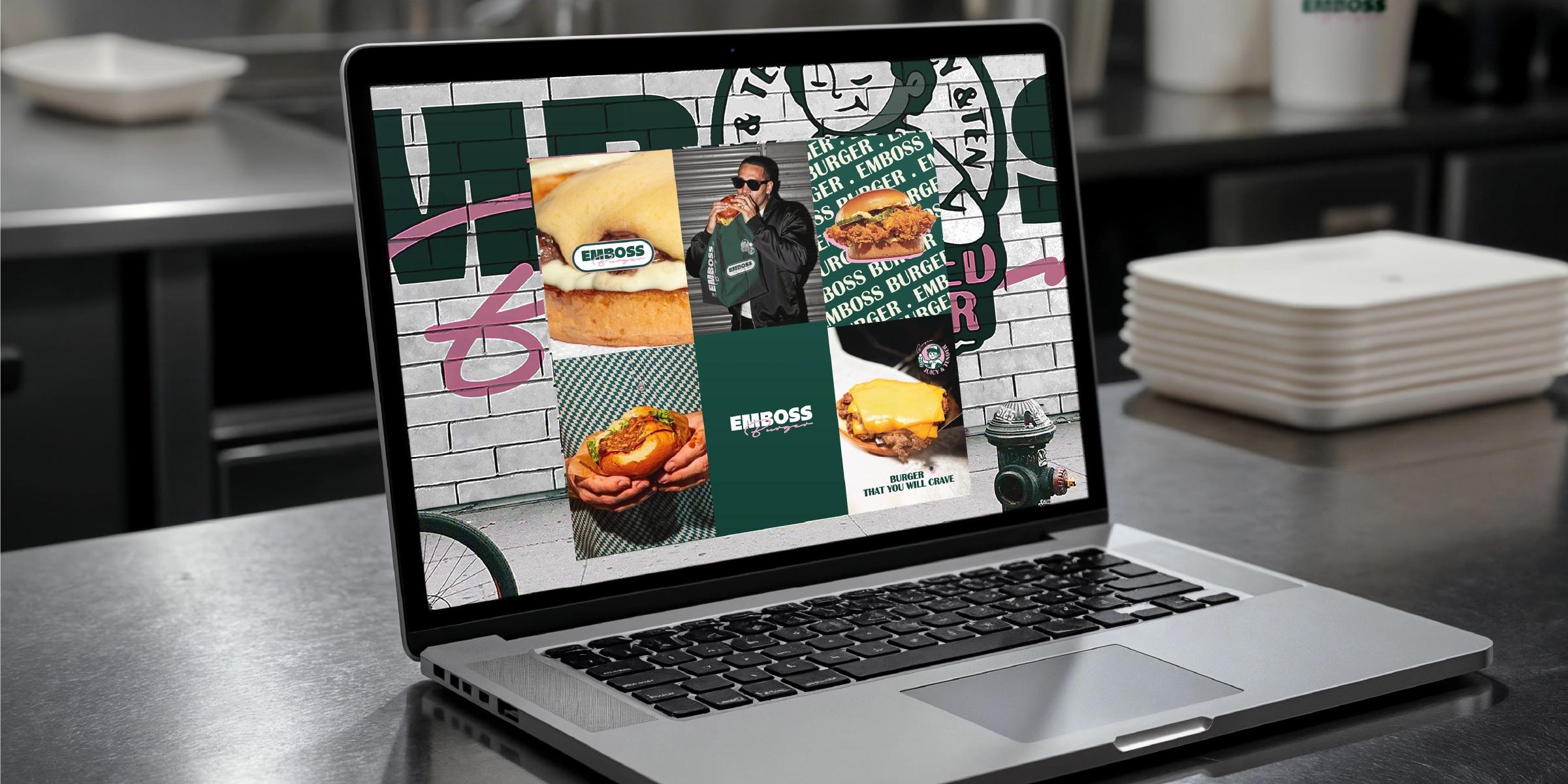
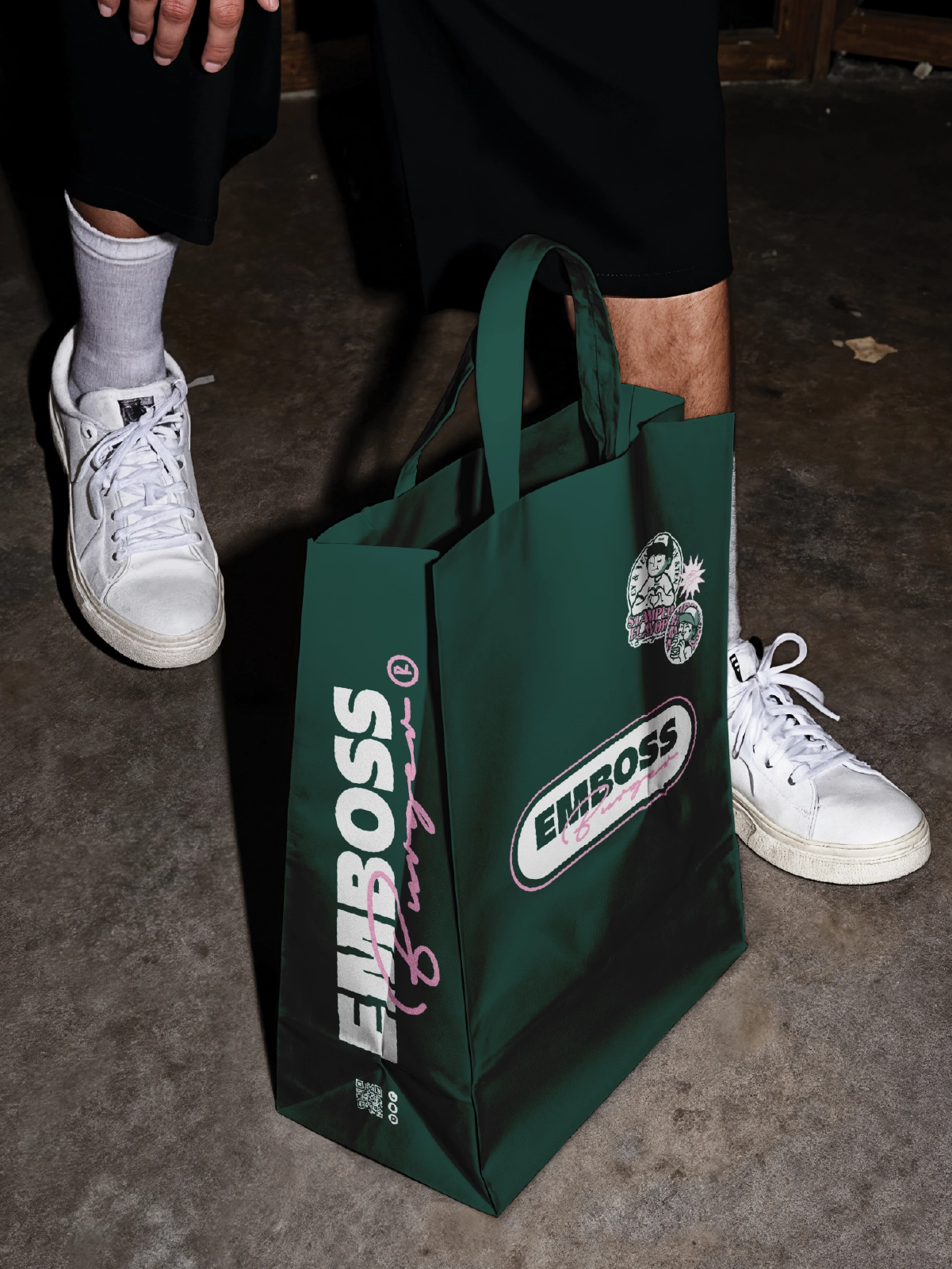
A burger brand built to feel stamped, memorable, and visually loud across packaging and campaigns.
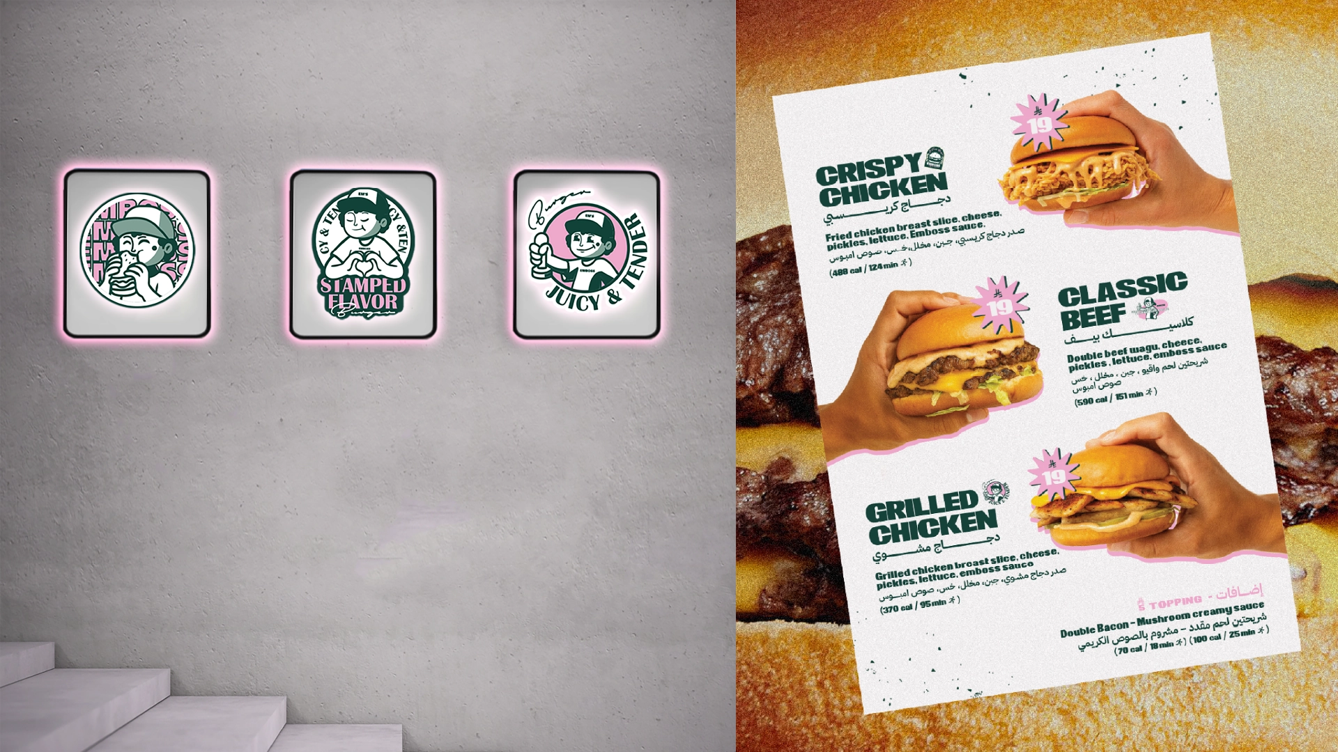
EMBOSS BURGER turns the idea of a "mark" into a full identity system—sticker-style badges, bold typography, and street-led visuals across packaging, menus, and launch assets.
Discovery
Understanding the core narrative, gathering requirements, and defining technical constraints.
Design
Crafting the visual language, typography scales, interactions, and motion curves.
Build
Developing the architecture and engineering the responsive frontend experience.
Launch
Performance optimization, accessibility audits, scaling, and final deployment.
Concept
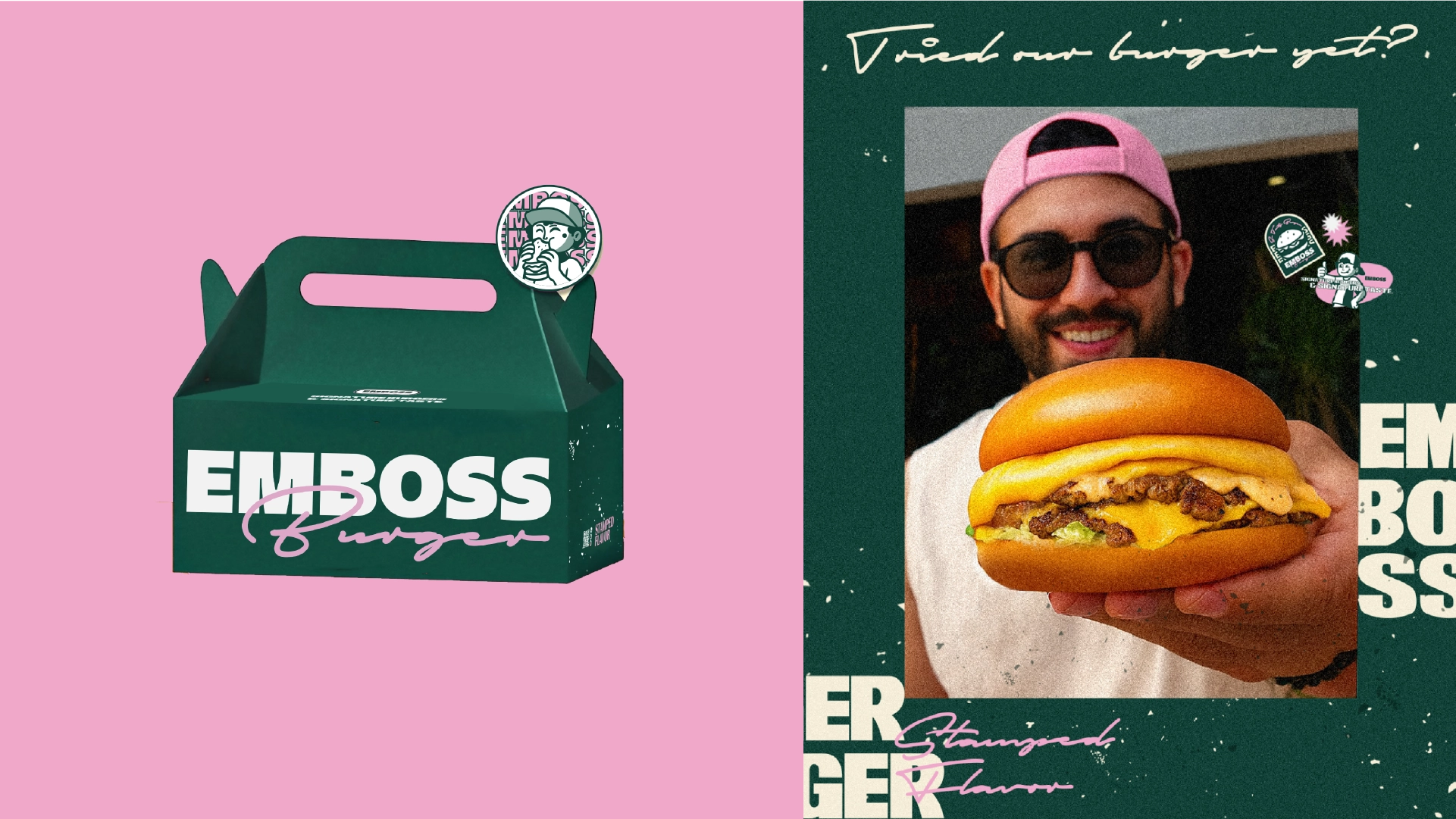
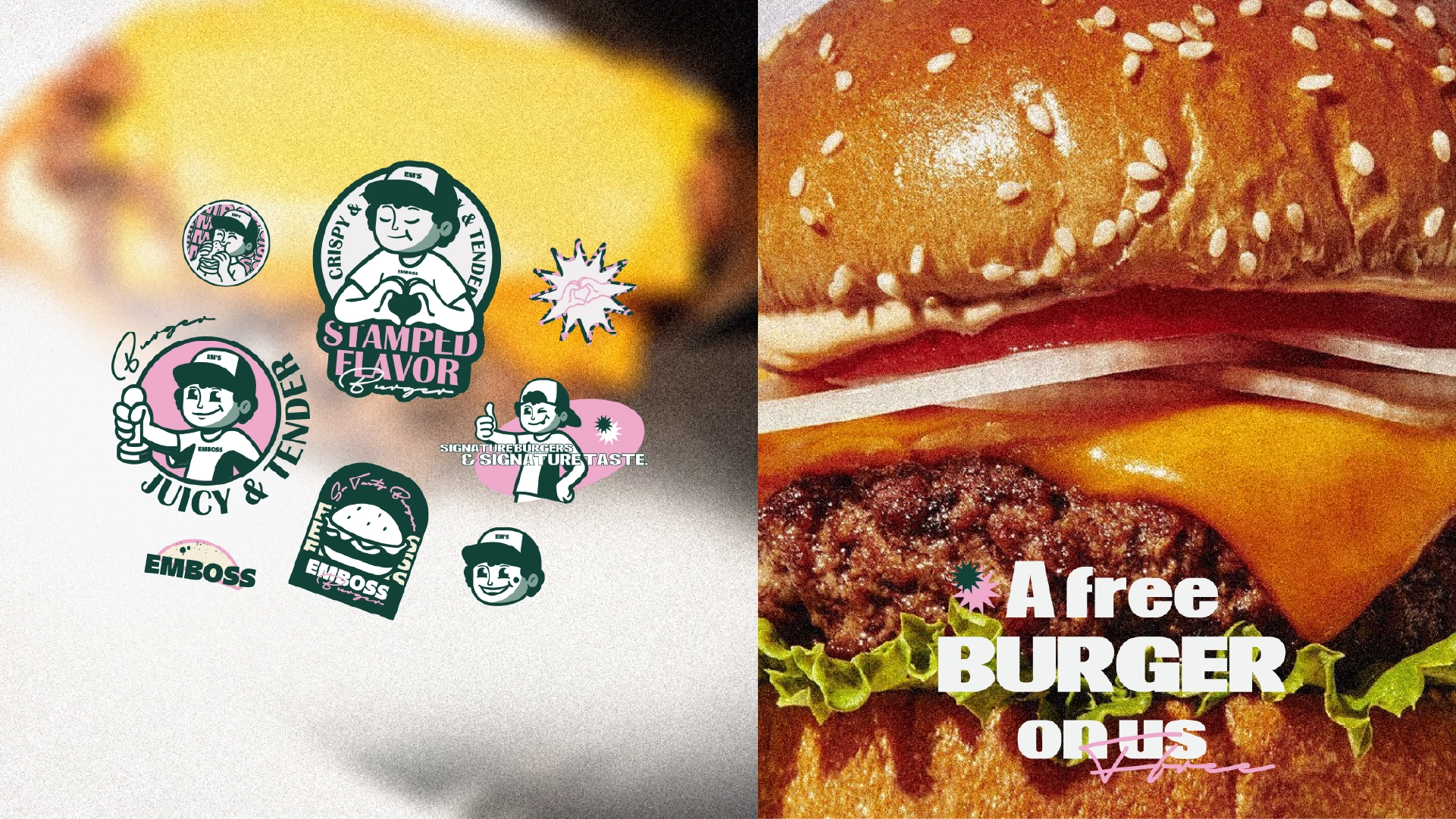
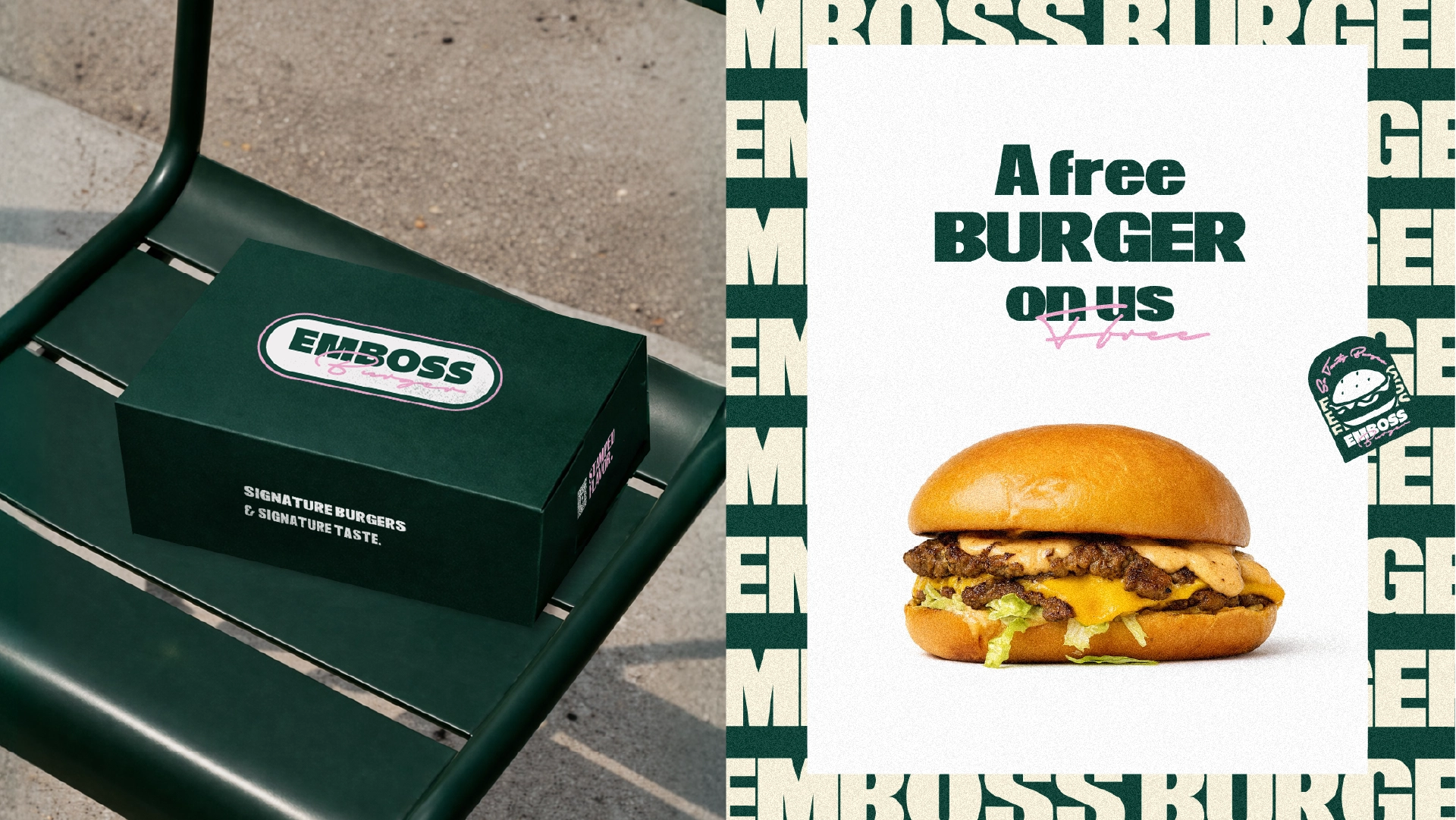
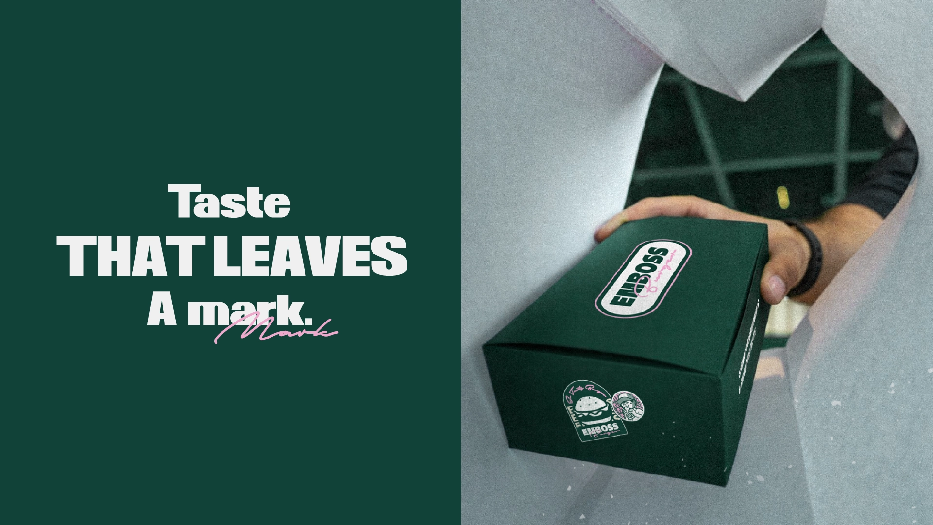
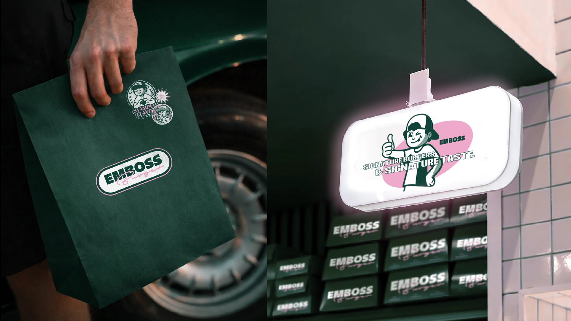
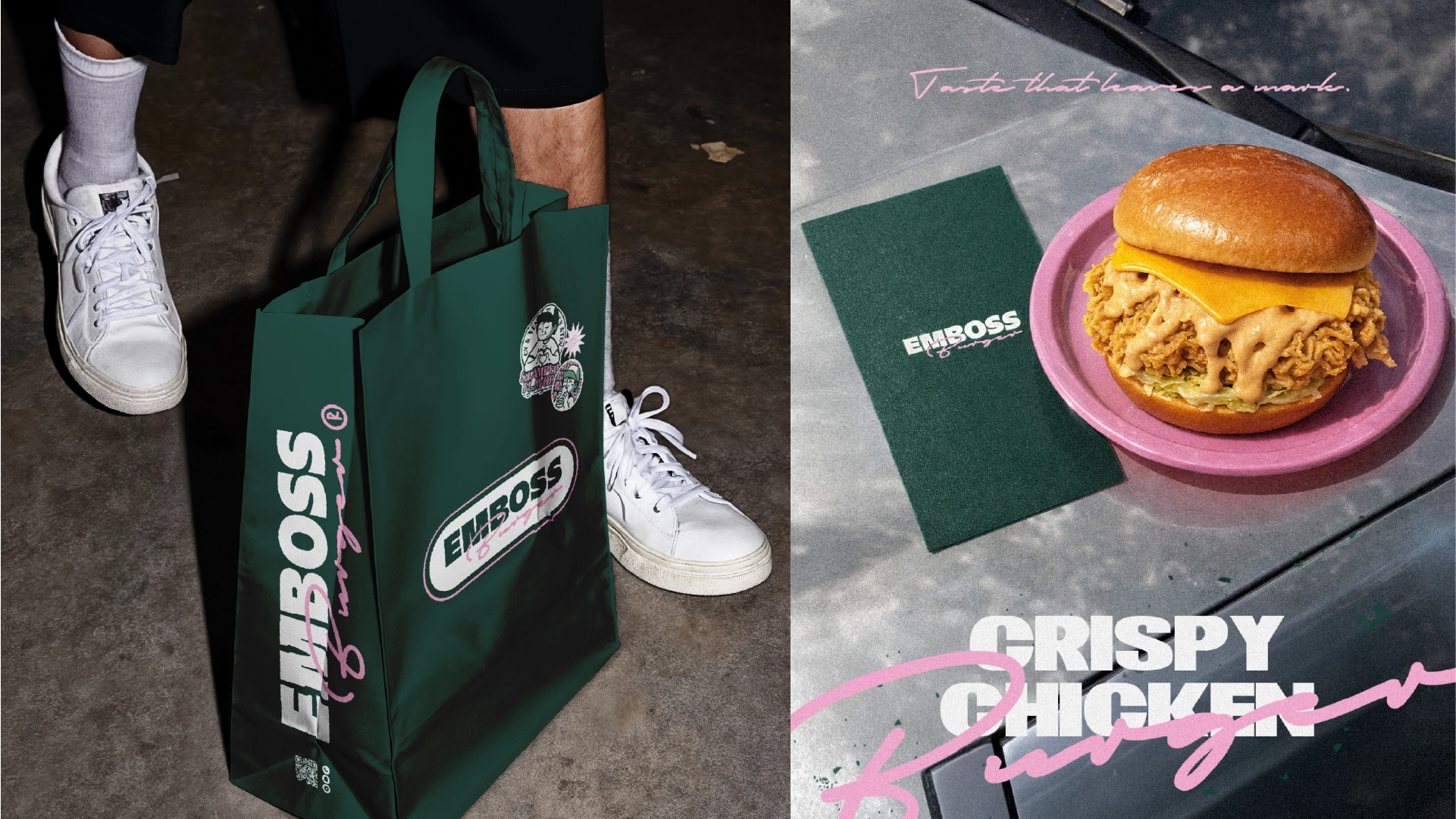
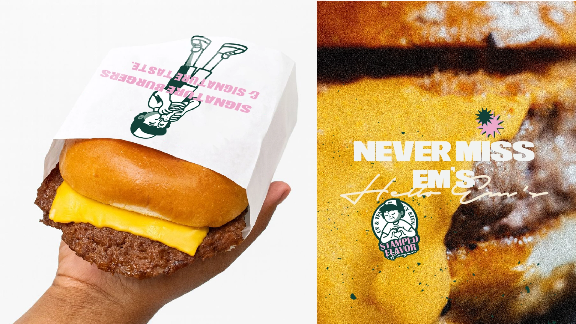
EMBOSS is a burger brand built around the idea of leaving a lasting mark.
modern street-style aesthetic to create a memorable and youthful experience. The handwritten “Burger” signature acts as a visual stamp, reinforcing the brand’s personality and unique flavor identity. A friendly mascot character was also introduced to add emotional connection and make the brand more recognizable across packaging, social media, and customer touchpoints. EMBOSS is designed to feel: Bold. Playful. Street-inspired. Memorable. A burger experience that stays with you long after the last bite.
Concept
EMBOSS is a burger brand built around the idea of leaving a lasting mark.
modern street-style aesthetic to create a memorable and youthful experience. The handwritten “Burger” signature acts as a visual stamp, reinforcing the brand’s personality and unique flavor identity. A friendly mascot character was also introduced to add emotional connection and make the brand more recognizable across packaging, social media, and customer touchpoints. EMBOSS is designed to feel: Bold. Playful. Street-inspired. Memorable. A burger experience that stays with you long after the last bite.
“Every pixel serves a purpose. Every interaction tells a story.”
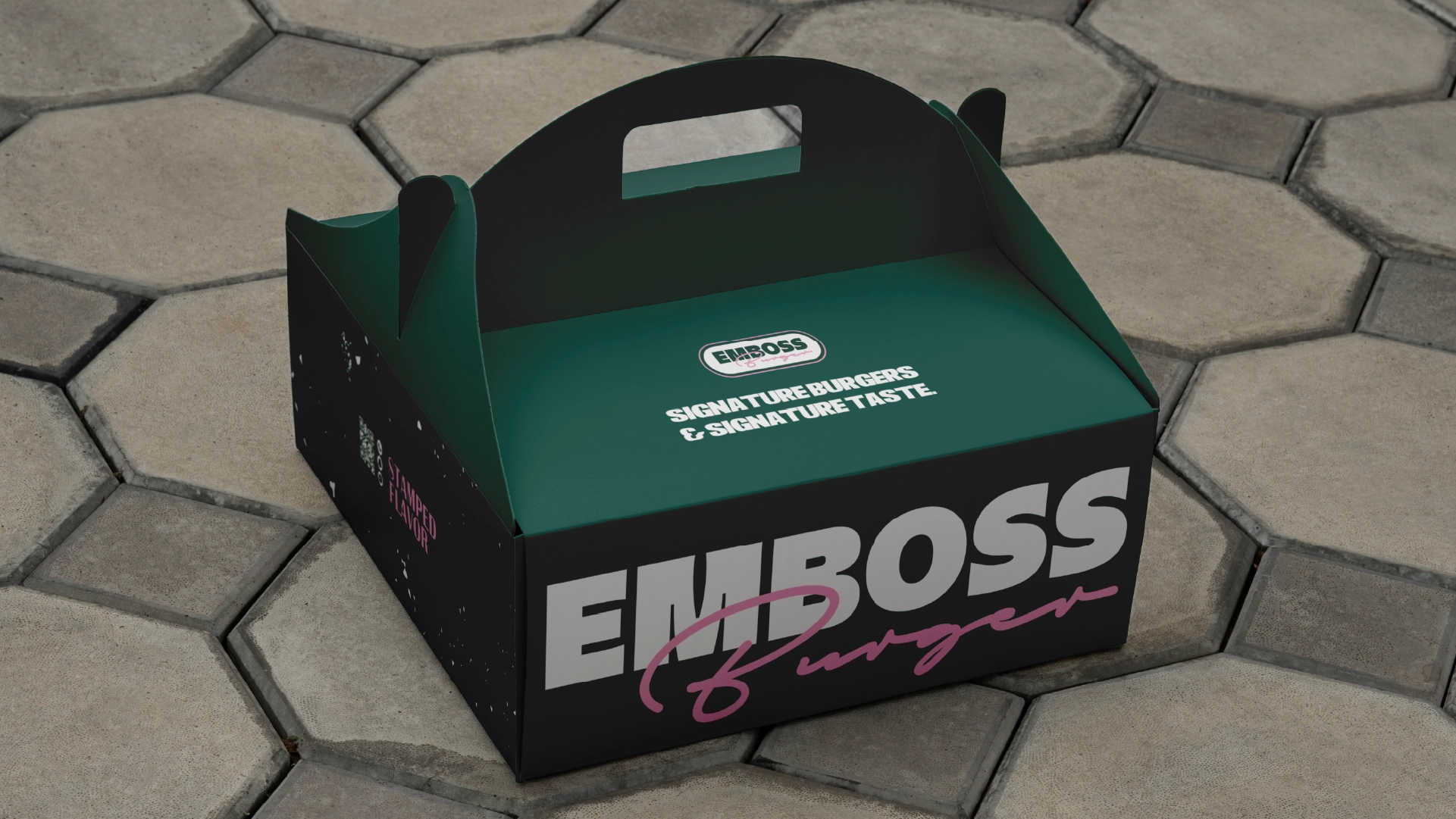
Color System
The EMBOSS color palette was inspired by burger ingredients and comfort food visuals. • Dark Green → freshness and bold identity • Pink → inspired by onions and signature sauces • Pearl → clean and modern balance • Butter Cream → warmth inspired by buns and creamy textures
Color System
The EMBOSS color palette was inspired by burger ingredients and comfort food visuals. • Dark Green → freshness and bold identity • Pink → inspired by onions and signature sauces • Pearl → clean and modern balance • Butter Cream → warmth inspired by buns and creamy textures
The carefully curated palette that brings the digital experience to life.
Results & Impact
Project Impact
Key outcomes that define the project's success and lasting value.
1 of 3
Recall
Stronger visual recall through a compact sticker-and-logo system built around the 'mark' concept.
2 of 3
Consistency
A unified identity across menu, packaging, merchandise, and campaign touchpoints.
3 of 3
Flexibility
A brand language that adapts cleanly to storefront presence and social content formats.
Related projects
Services: Branding, Visual Identity, Packaging Direction, Art Direction