PuregeriBurger
PUREGERI
Fresh bite. Pure taste.
A youthful, modern burger brand built around freshness, simplicity, and playful character.
Discovery
Understanding the core narrative, gathering requirements, and defining technical constraints.
Design
Crafting the visual language, typography scales, interactions, and motion curves.
Build
Developing the architecture and engineering the responsive frontend experience.
Launch
Performance optimization, accessibility audits, scaling, and final deployment.
Concept
Fresh bite, pure taste
Puregeri was created around the ideas of freshness, simplicity, and a playful modern attitude. The brand presents burgers in a way that feels clean, youthful, and easy to connect with.
Rather than following the heavy visual language common in burger brands, its identity supports the idea of a fresh bite, pure taste, and an experience that is straightforward, memorable, and fun.
“Every pixel serves a purpose. Every interaction tells a story.”
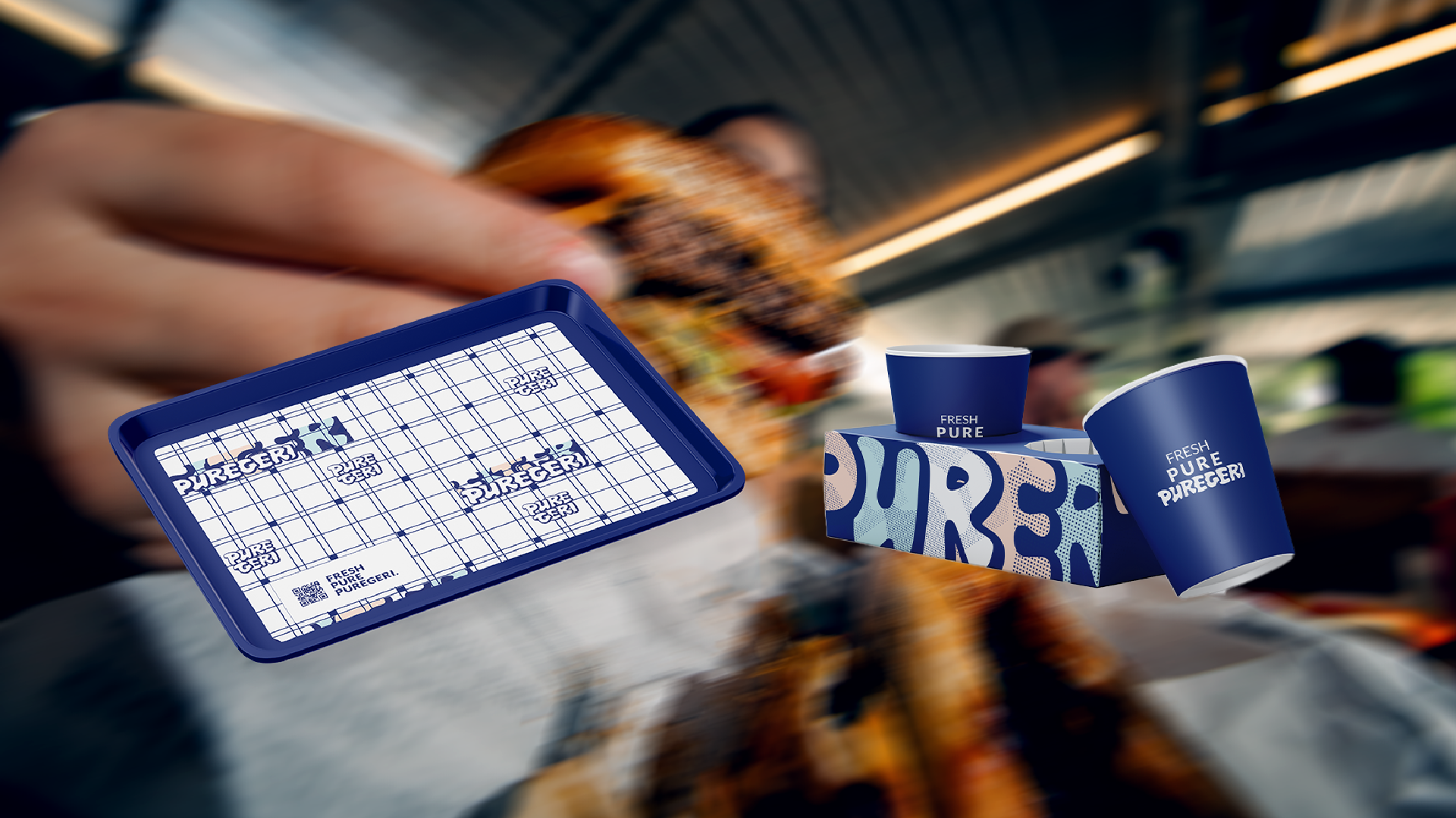
Color System
Bold structure meets refreshing softness
Puregeri's palette combines bold structure with a refreshing softness. Dark blue provides strength, clarity, and a distinctive visual anchor, while beige adds warmth and softness.
White reinforces cleanliness and simplicity, and Tiffany blue introduces a youthful and fresh accent. Together, these colors create a modern and balanced system that feels crisp, bright, and highly adaptable across packaging and brand touchpoints.
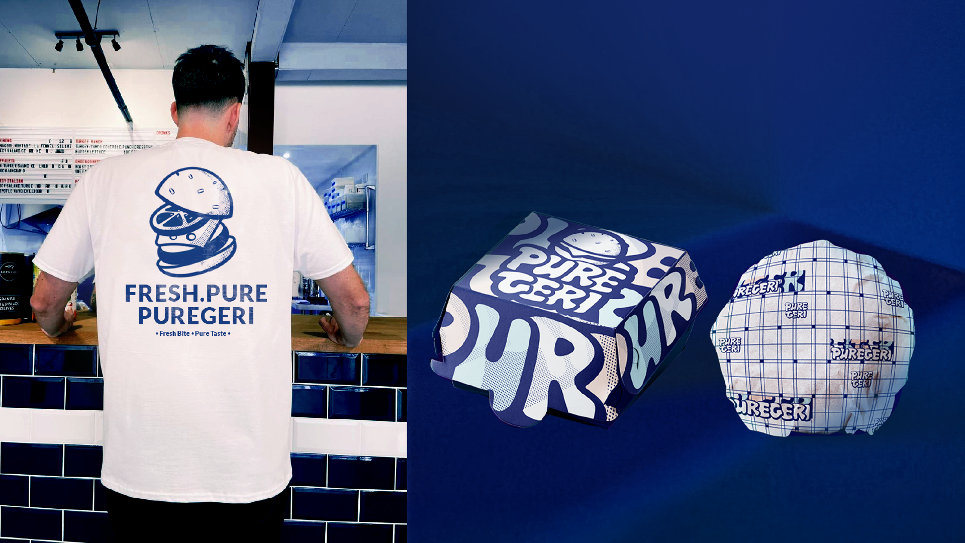
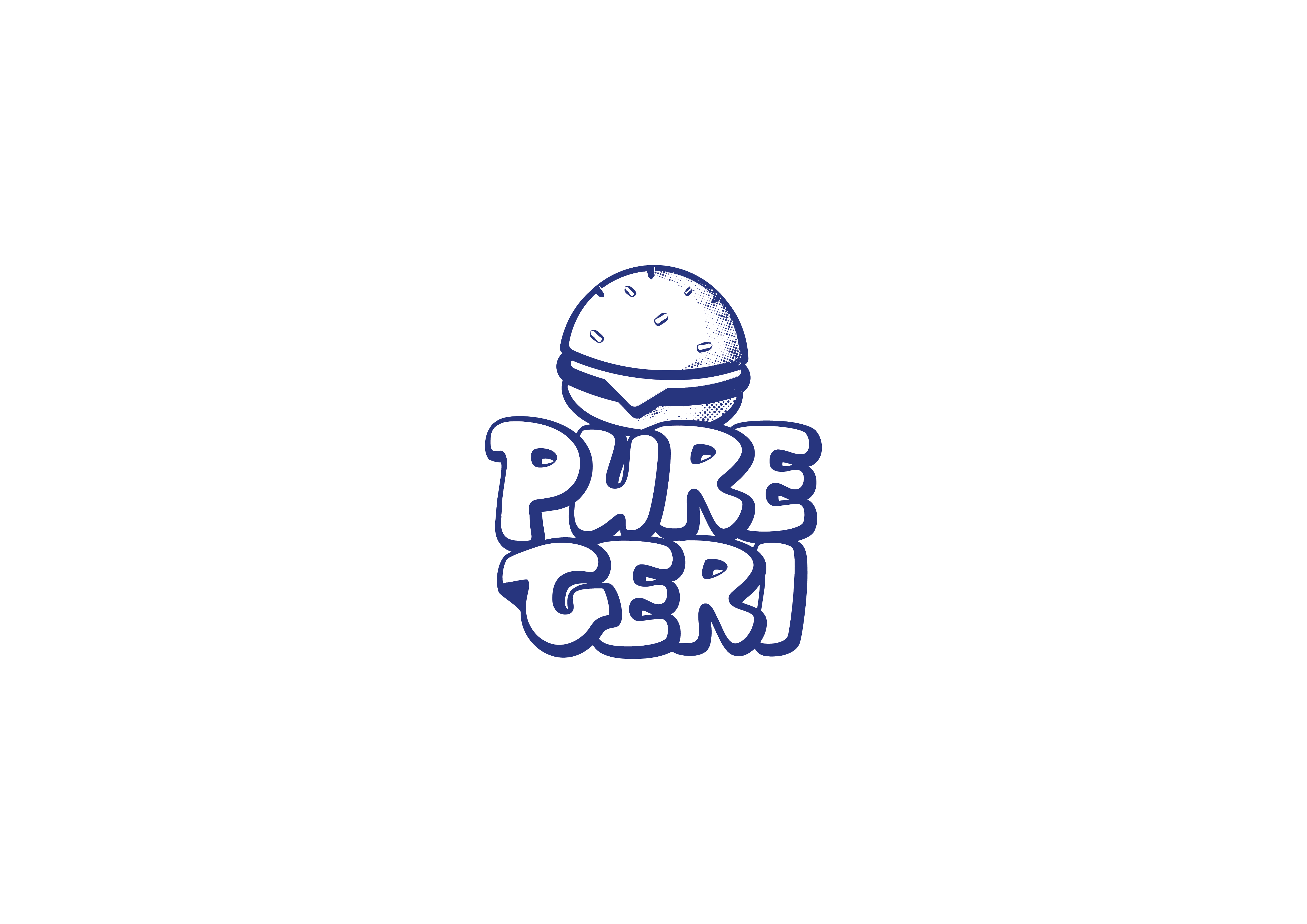
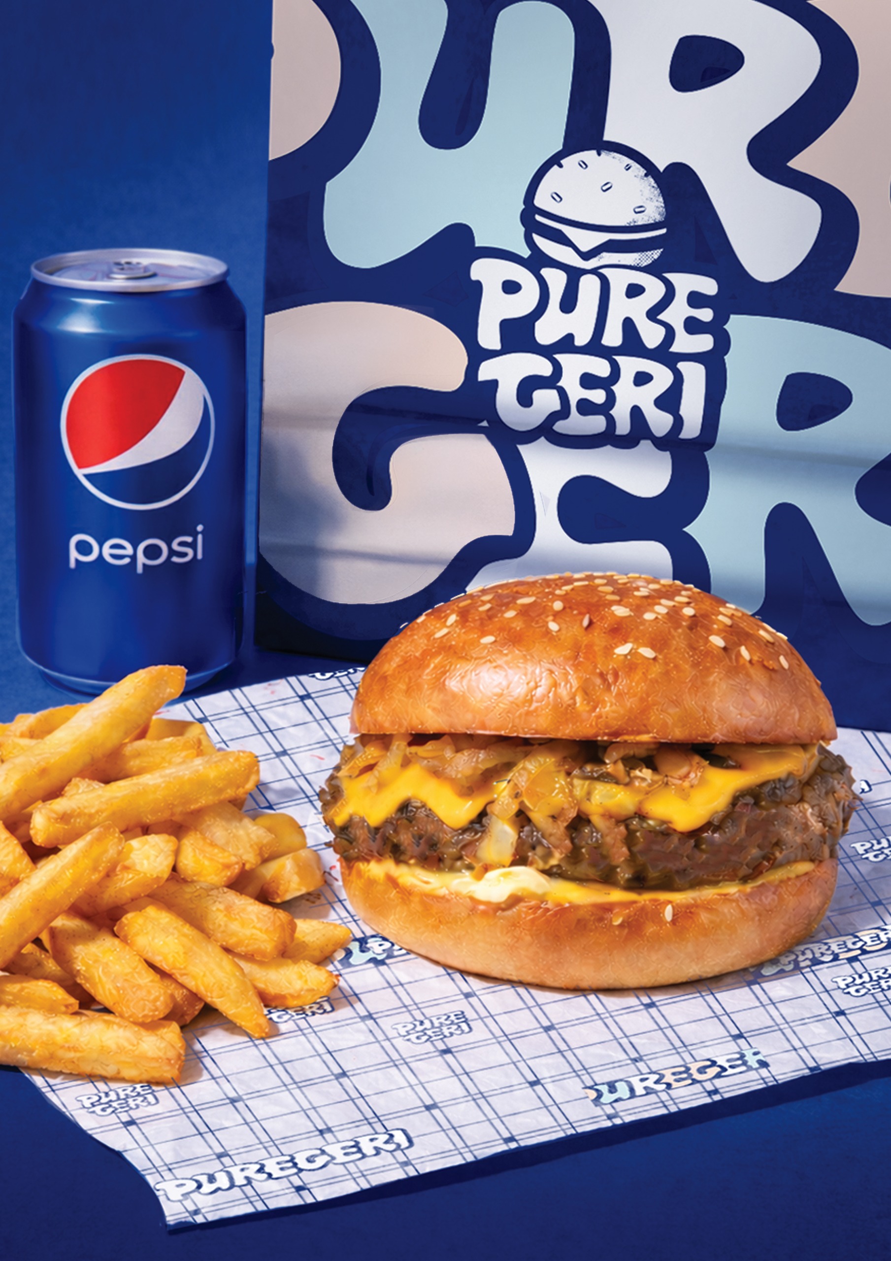
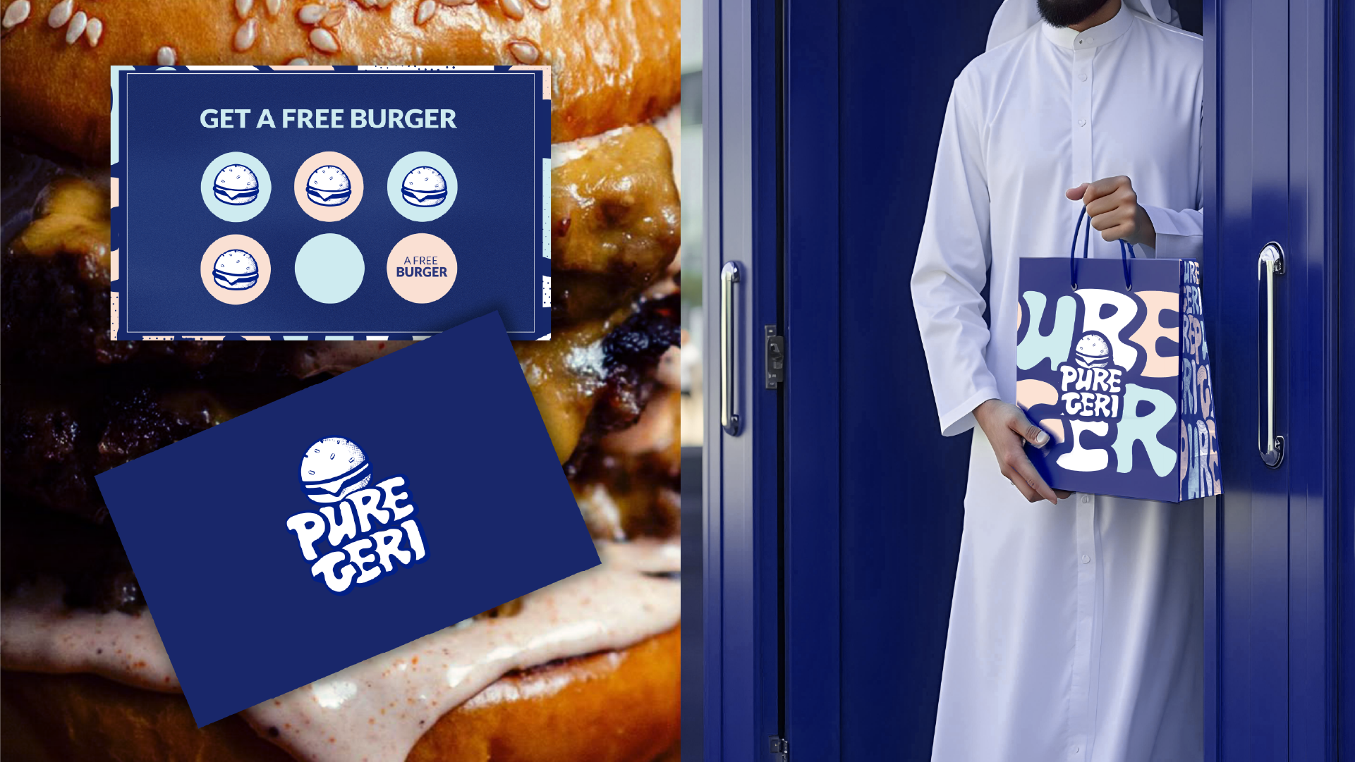
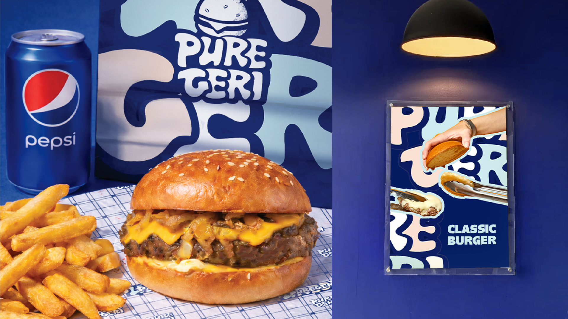
Visual Identity
Built to stand out in a crowded food market
The visual identity of Puregeri is bold, playful, and highly recognizable. It is built around a strong typographic logo, burger-inspired forms, and flexible graphic patterns that bring energy to the brand.
The identity was designed to perform clearly across burger boxes, wrapping paper, bags, and campaign visuals, giving the brand a youthful, organized, and easy-to-remember personality.
The carefully curated palette that brings the digital experience to life.
Results & Impact
Project Impact
Key outcomes that define the project's success and lasting value.